Designing a relaxed, immersive UI for a cozy first-person flower shop game, where every interface decision had to avoid pulling players out of the mood.
Cozy first-person flower shop simulator set in rural Japan, built by a 15-person multidisciplinary team. Sole UX/UI designer: research, personas, every wireframe, the visual design system, and in-engine coordination via UE5's UMG.
Jury recognition: "perfect effort-relaxation balance and strong market potential in the cozy gaming space."
Challenges
No Perforce access for the first two weeks: the UI programmer had already started building screens before I could review them. This flipped my role from leading the build to coordinating with an implementation already in progress. A pattern of unreviewed builds later required systematic task lists and daily check-ins to regain oversight before final submission.
Learnings
Documentation alone doesn't communicate. I built thorough Miro boards and specs, but people don't check Miro boards unprompted; you have to actively create touchpoints. The final two weeks, when I added structured daily sync lists, were dramatically more productive than the first five. That gap was entirely on my communication approach, not the team.
Tools
FigmaUE5 / UMGMiroPhotoshopPerforceJira
The Challenge
How do you design an interface that doesn't distract, keeping players in a peaceful, sensory world, while still giving them enough information to make meaningful decisions?
Cozy games live and die by atmosphere. Every tooltip, menu transition, or intrusive prompt risks breaking the emotional contract with the player, the unspoken promise that this is a stress-free space. At the same time, players needed to understand the Hanakotoba bouquet system (matching customer wishes to Japanese flower meanings) without explicit instruction. Over-engineer the UI and it feels like a chore; under-engineer it and players are lost. The original colour-memorisation mechanic made this worse, not better, by adding cognitive load to what should have been a meditative experience.
Process
01
Research: Understanding the player and the genre
We were designing for a community we weren't part of. Building on assumptions would have been expensive to fix in-engine at week 5. Running research first meant every decision after had evidence behind it, including the one that changed the core mechanic.
Surveyed 42 people from cozy game communities online, ages 18–35. The results were specific enough to be useful. 79% were there for relaxing, low-pressure gameplay, which meant any design choice that raised tension was working against the brief. 57% were drawn in by beautiful art and music, validating the visual ambition before a single asset existed. 85% said story mattered, which shaped everything from how orders are delivered to how the world communicates. And 50% wanted a creative outlet, which pointed directly toward player-driven crafting over prescriptive tasks.
What draws players to cozy games?
Pre-development survey · 42 participants from cozy game communities
Relaxing gameplay
79%
Beautiful art & music
57%
Creative expression
50%
Story matters
85%
✦
Most anticipated single element
28.6%: Ghibli-inspired visuals
The highest-ranking response, validating the art direction before a single asset was made.
↓ Most unexpected finding: it directly changed the game
Survey finding
Players wanted to learn something, not just relax.
A significant share wanted cozy games to teach them something new, or let them discover it gradually. This directly contradicted the colour-memorisation bouquet mechanic we had planned.
→
Design decision
Replaced colour memorisation with Hanakotoba: Japanese flower language.
Players read customer letters and select flowers based on their actual meaning in Japanese culture. Something real to learn, woven into the world. No quiz, no pressure.
Alongside the survey, I played and studied games the target audience actually loved, not just for aesthetic, but for how they felt to play. I organised observations into four lenses: the core reference games that shaped design thinking, the art direction that set visual tone, the UI patterns borrowed and adapted, and the bouquet interaction model that directly informed the workbench mechanic.
Game References
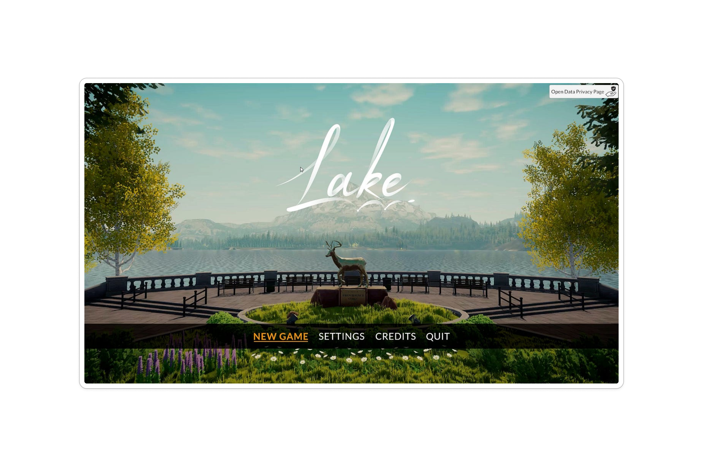
Six games studied for their pacing, player motivation, and how they balanced depth with low-pressure play. Each taught something specific, from core loop structure to how contextual prompts can feel organic rather than instructional.
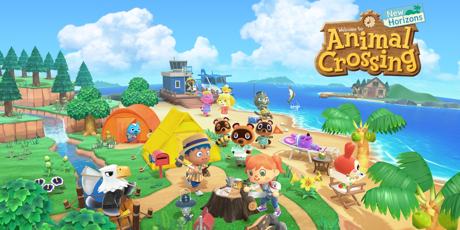
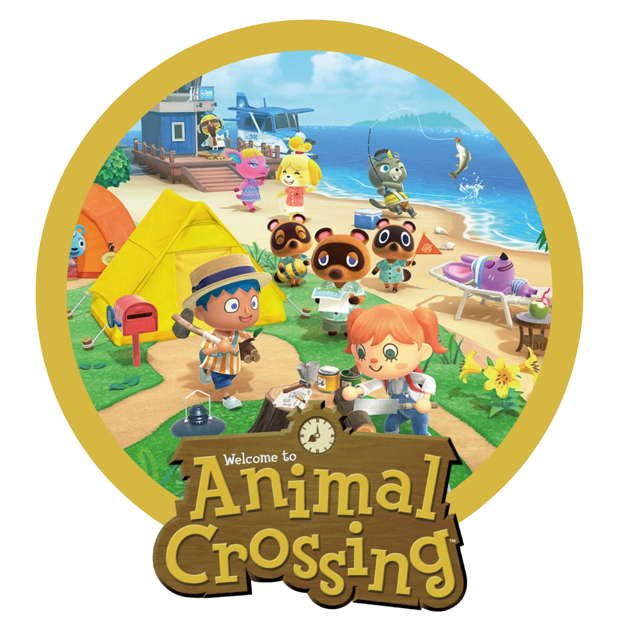
Animal Crossing: New Horizons
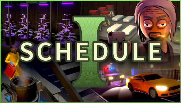
Schedule 1
Easy Delivery Co.
Dave the Diver
Rune Factory 5
Lake
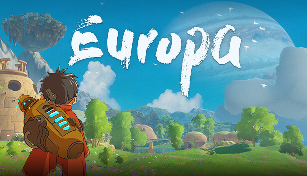
Europa
Art Direction
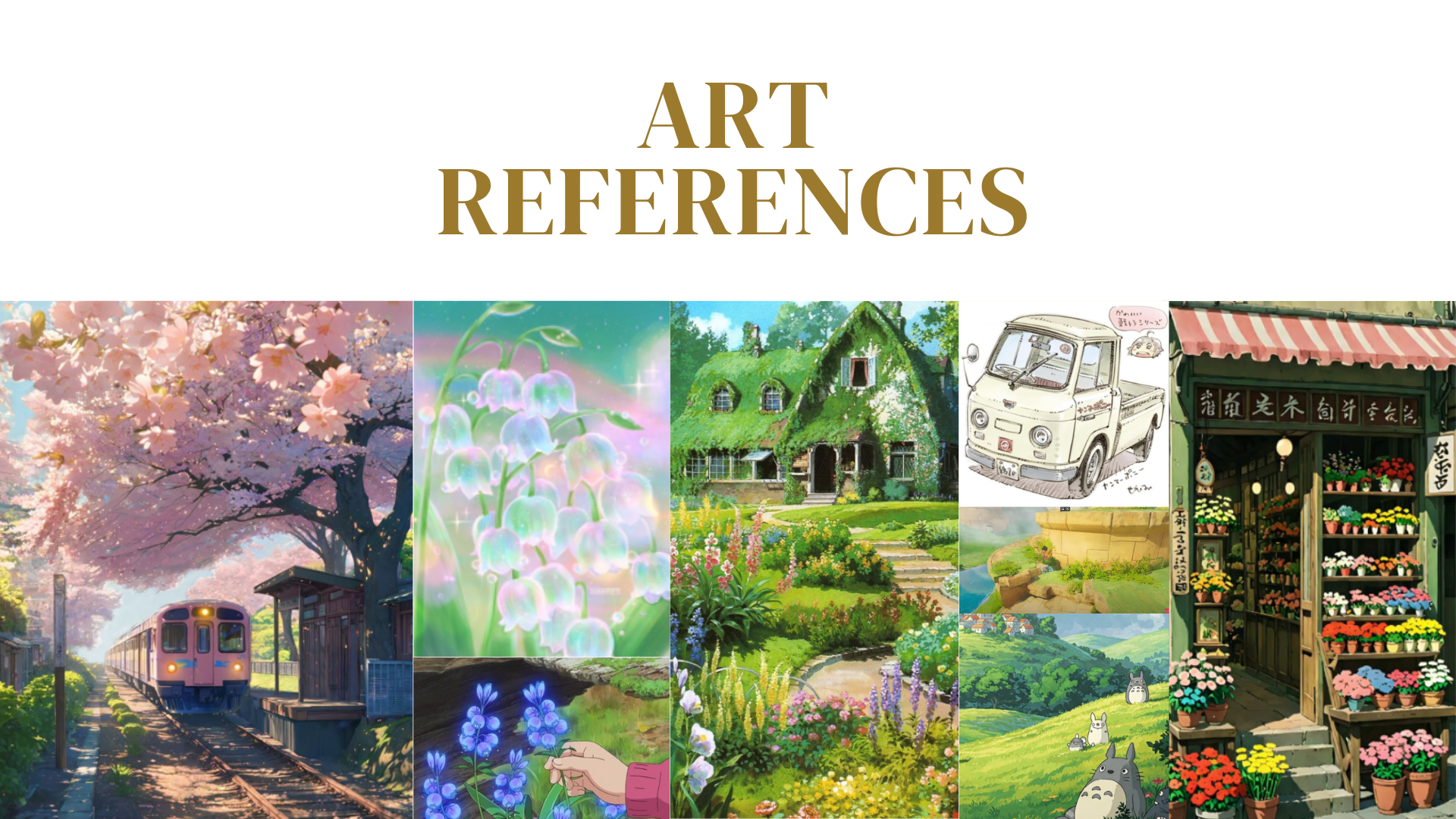
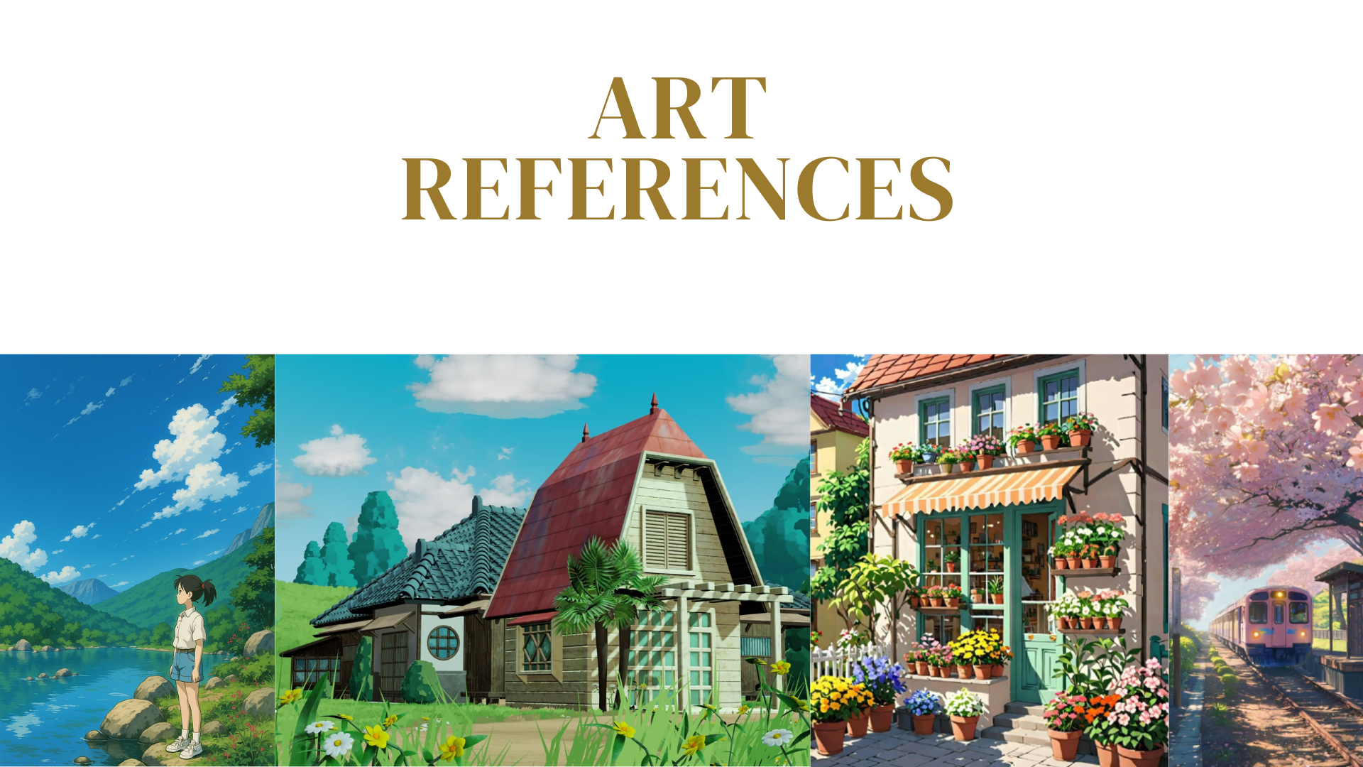
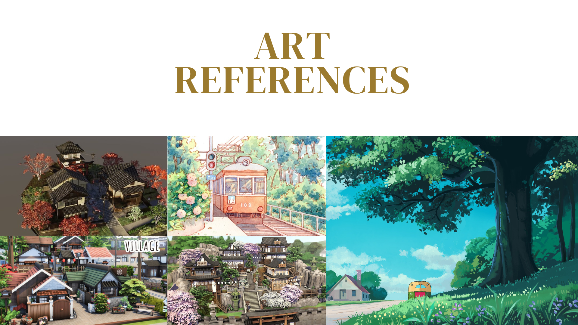
The game's visual identity was anchored in Ghibli aesthetics, soft light, warm architecture, a world that feels gently alive. These mood boards were shared with the team early to align on what "cozy" should look and feel like before any assets were created.
Ghibli & cozy flora, primary art tone
Cottage architecture & warm interiors
Village scale & environment atmosphere
UI Inspiration
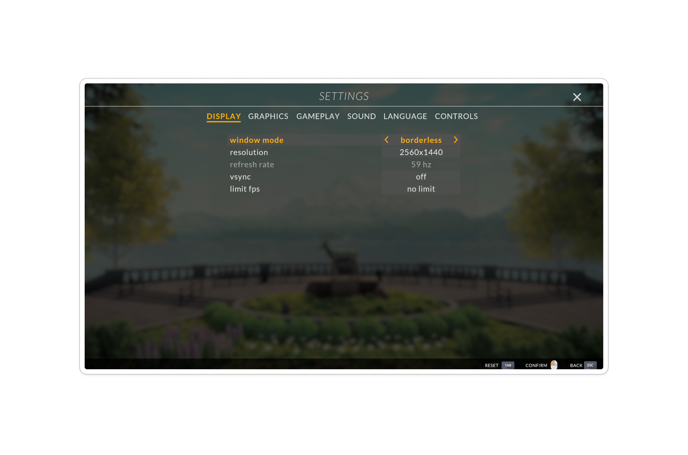
For UI specifically, I studied how calmer games structure menus, grounded layouts, earthy tones, minimal chrome. The final slide is an early visual prototype I made for Flower Shop, testing that direction applied to our own game before any screens were built.
Menu layout reference
Settings screen structure
Early Flower Shop UI prototype
Bouquet Interaction Reference
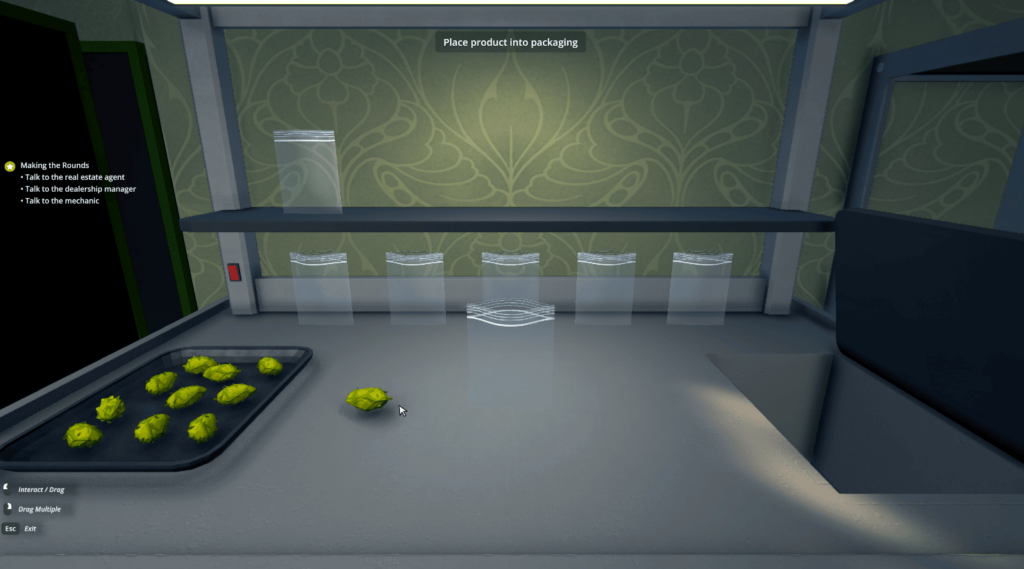
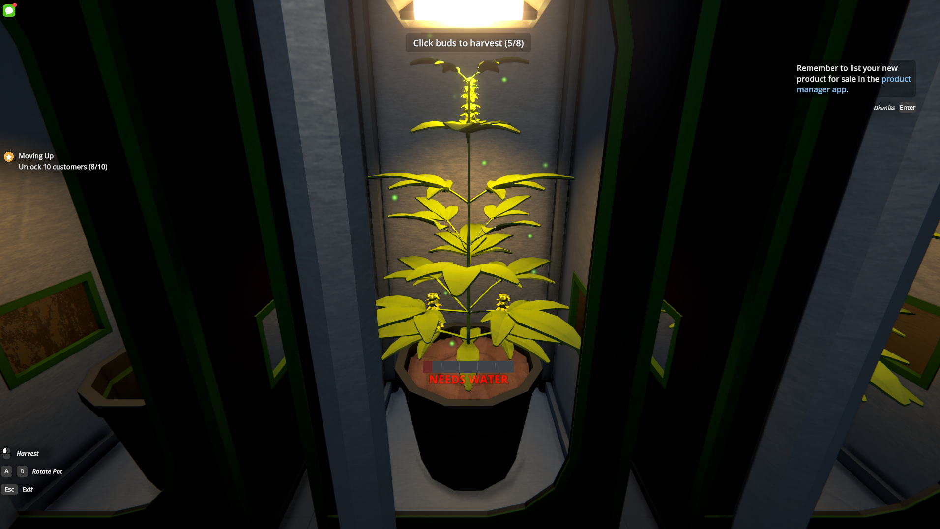
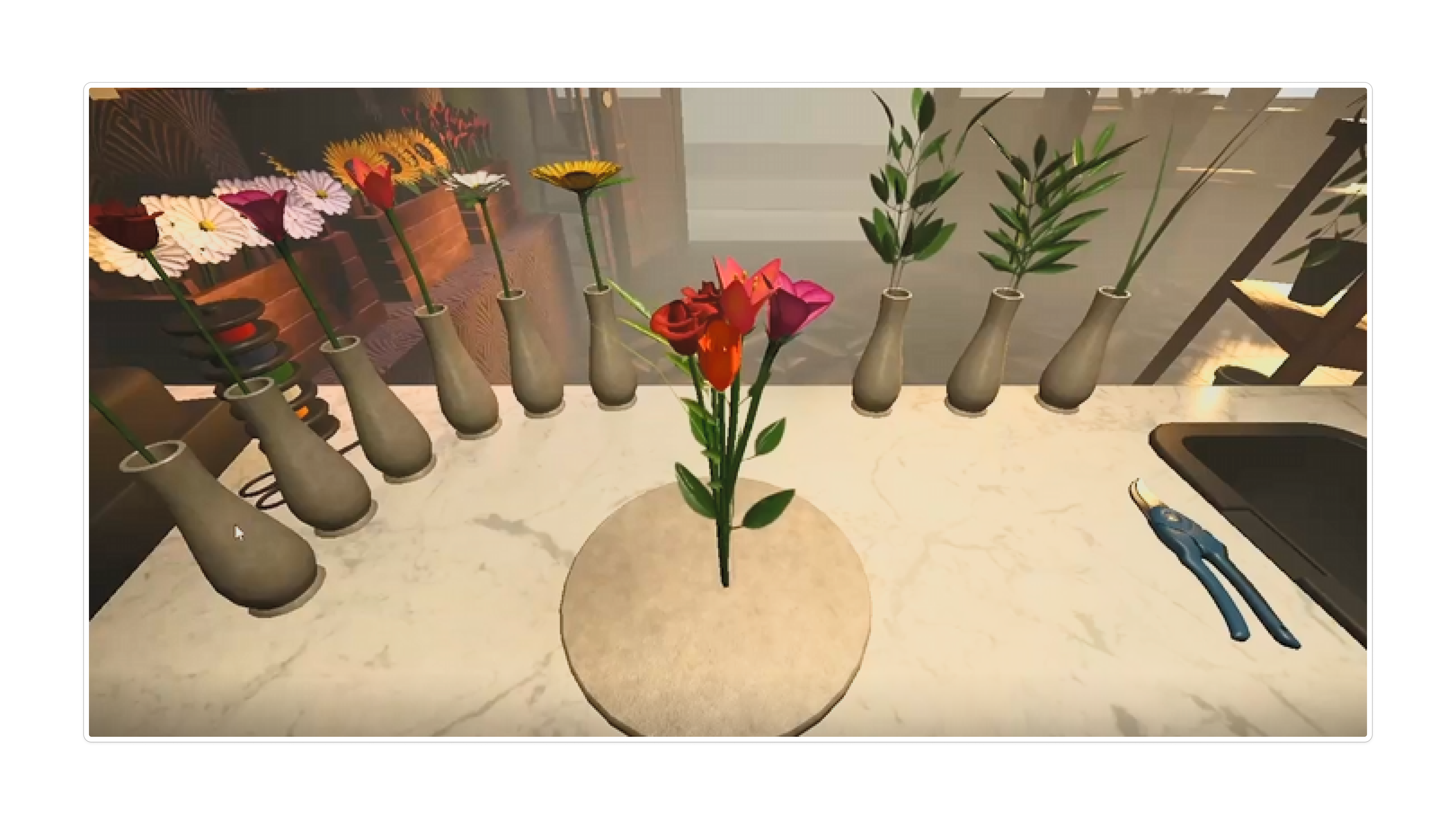
The workbench mechanic needed to feel physical, not menu-driven. Schedule 1's drag-and-drop gave us the interaction model. The final slide is from a Reddit post by an indie dev building a flower shop game in Godot two years ago, proof this kind of mechanic resonates and works.
Schedule 1, bagging mechanic
Schedule 1, item pickup
Indie flower shop (Godot), Reddit reference
Game Flow Design
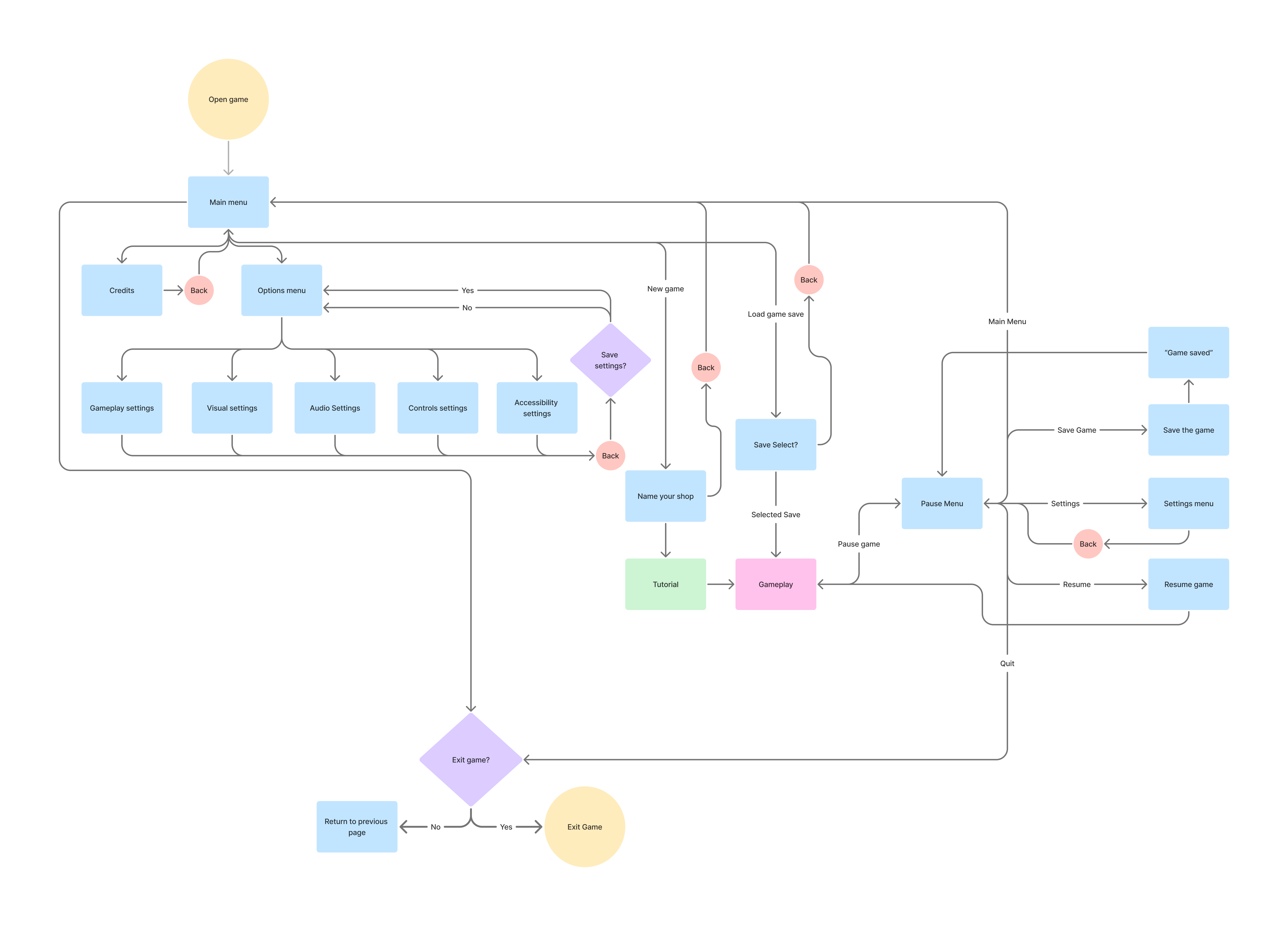
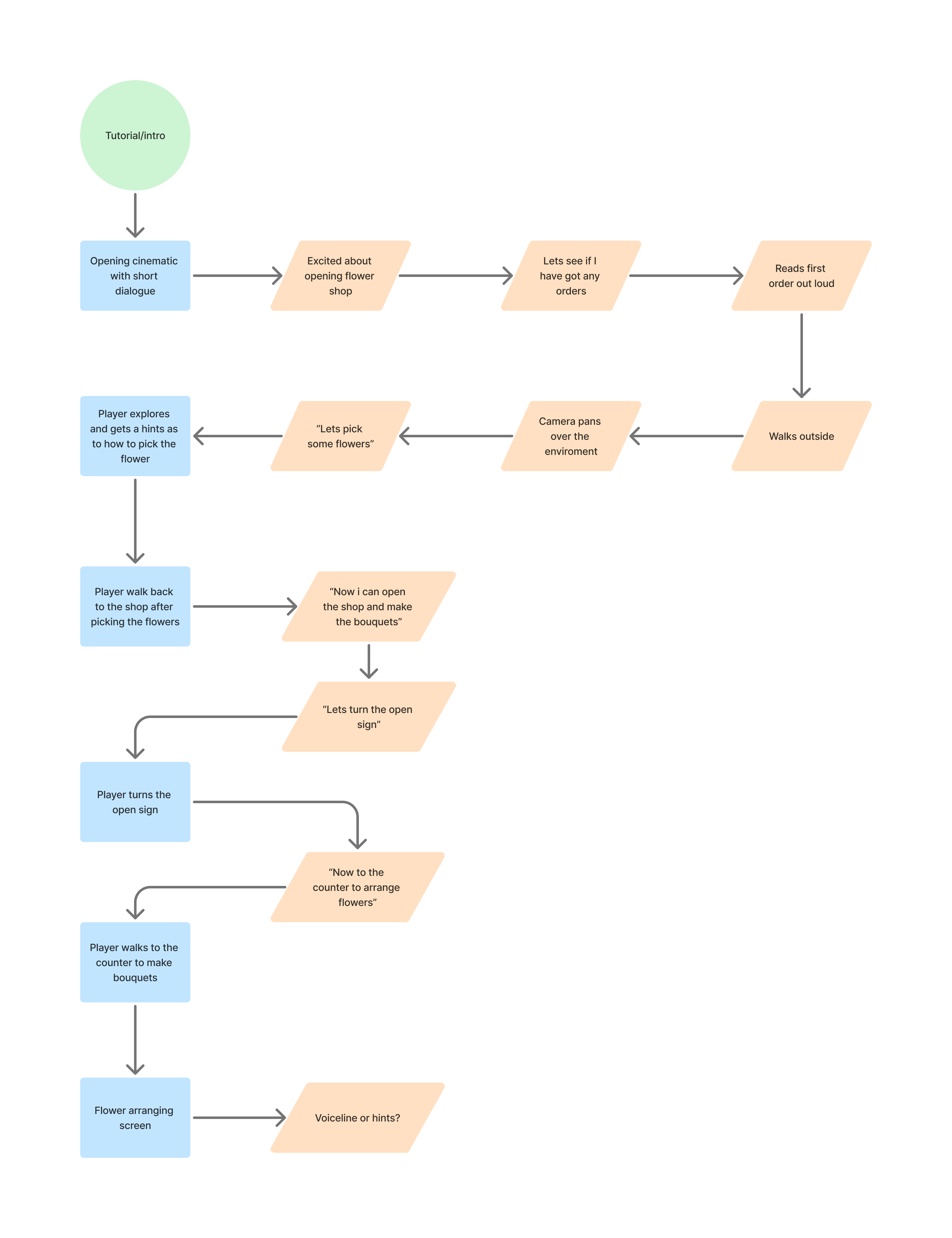
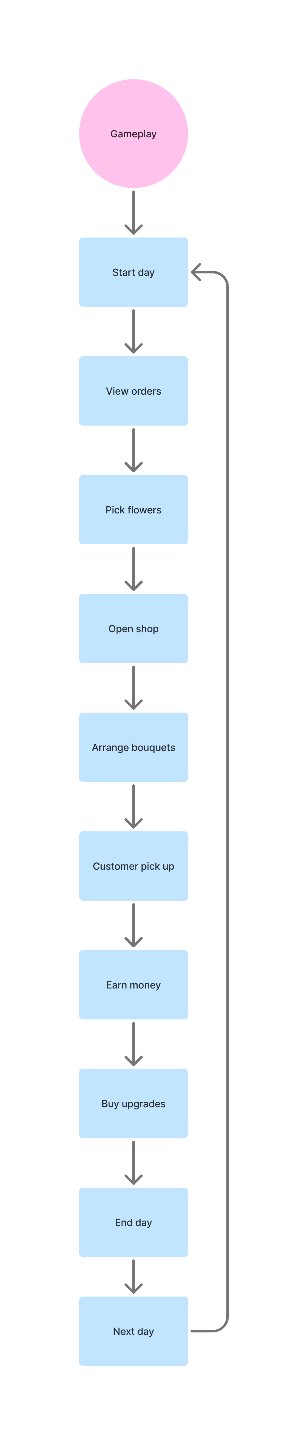
Three flowcharts mapped the full game system: the overall structure, the tutorial onboarding sequence, and the core gameplay loop. Used to align the team on player decision points and screen transitions before any UI was built.
02
Persona: Designing for a specific person, not an aggregate
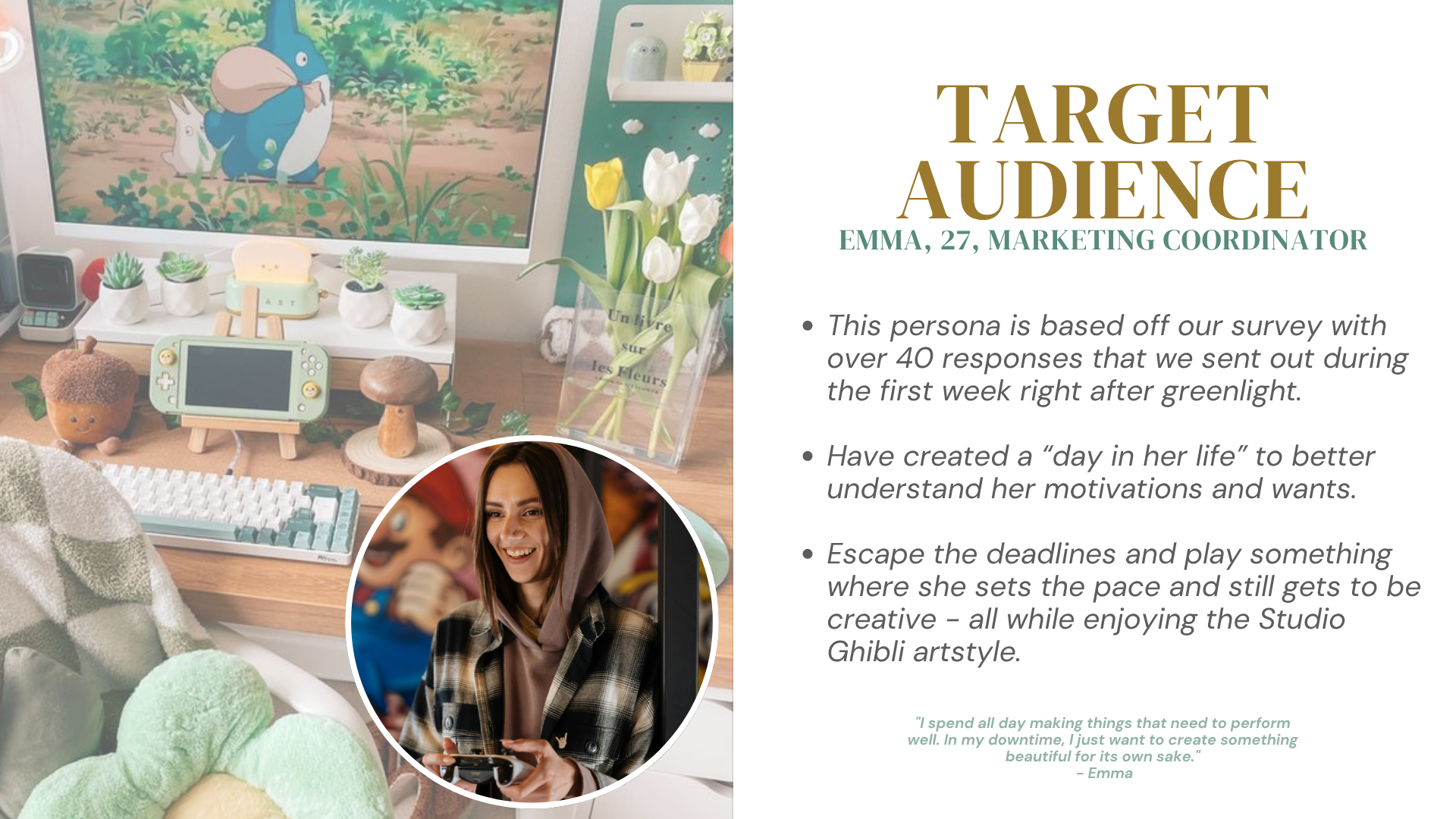
Survey data tells you what people want in aggregate, but designing for an average serves nobody. Building Emma from our actual survey results gave the whole team a shared, specific person to test decisions against. She became especially useful when I needed to argue for UX changes with non-designers: "Emma wouldn't know what this button does on first sight."
Emma is a 27-year-old marketing coordinator. She wants to decompress after work, find a creative outlet that doesn't punish her, and learn something gently without being quizzed. Her pain points read directly from our survey data: complex UI that breaks immersion, mechanics that require tutorials to understand, interfaces that make her feel like she's doing it wrong. Every design decision after this (Hanakotoba, contextual prompts, the letter-format orders) was tested against Emma before it was built. The games shown alongside are titles we imagined she'd play, drawn from survey data about what the target audience was already playing and our own read of her tastes.
Presented to the full team
Emma plays
03
Wireframing: Planning before building, and correcting what was built without it
With 15 people building simultaneously in Unreal Engine, a wireframe reviewed before implementation is infinitely faster than a redesign after. In practice, delayed Perforce access meant the programmer had already started building before I could review anything. The wireframes still mattered: they became the correction standard, the document I used to pull every drifting screen back into alignment.
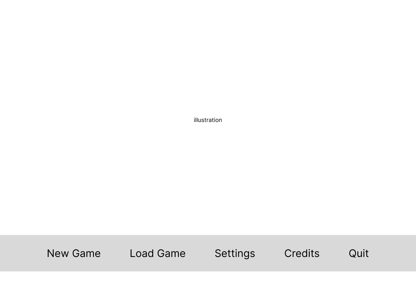
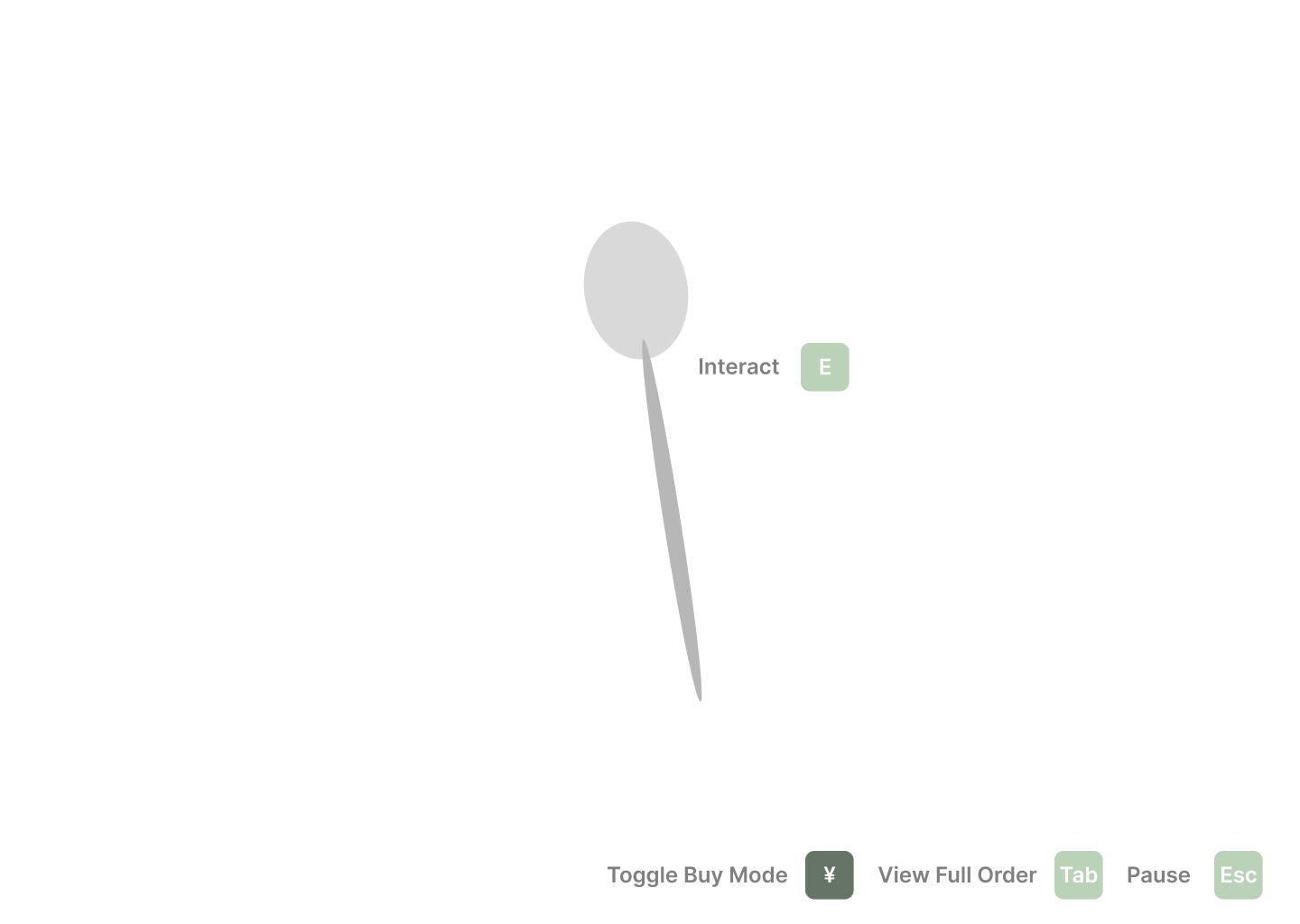
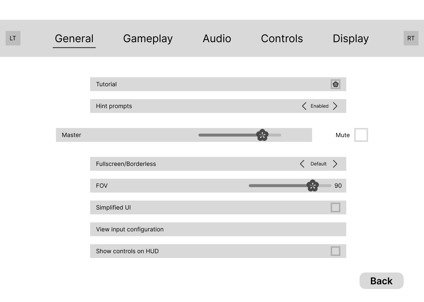
Wireframed all major screens in Figma: main menu, HUD, bouquet crafting, customer order, shop customisation, and all settings pages. Created style guides separating functional requirements from visual polish so the programmer could build logic while I handled the visual layer. Key design decision at this stage: advocating for the Hanakotoba system to replace colour memorisation, justified directly by survey data.
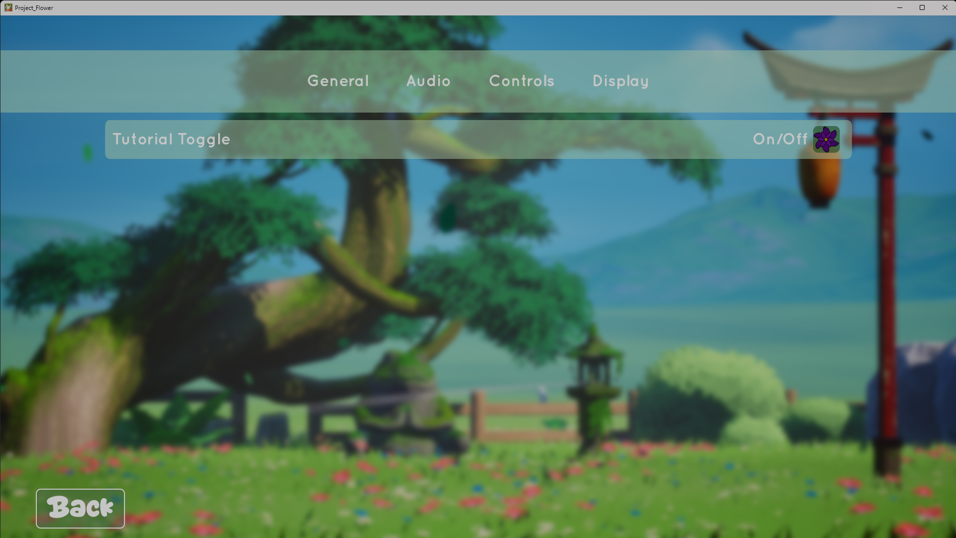
Worth noting: this was my first game project in Unreal Engine, and we hadn't covered UMG (Unreal's UI system) in any classes before the project started. My training up to that point was in game design and level design, not engine-side UI implementation. I initially handed the UI build to the programmer and focused on Figma, which is where the gap opened. When I noticed the screens weren't matching the wireframes, I went into UMG myself to fix what I could, learning the tool on the fly to close the distance between what I'd designed and what had shipped.
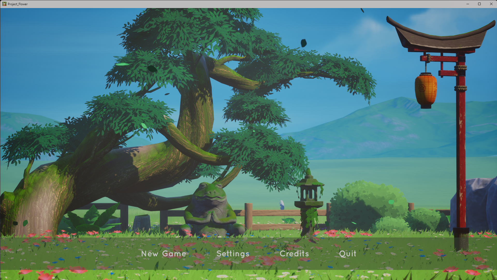
Main Menu
Wireframe
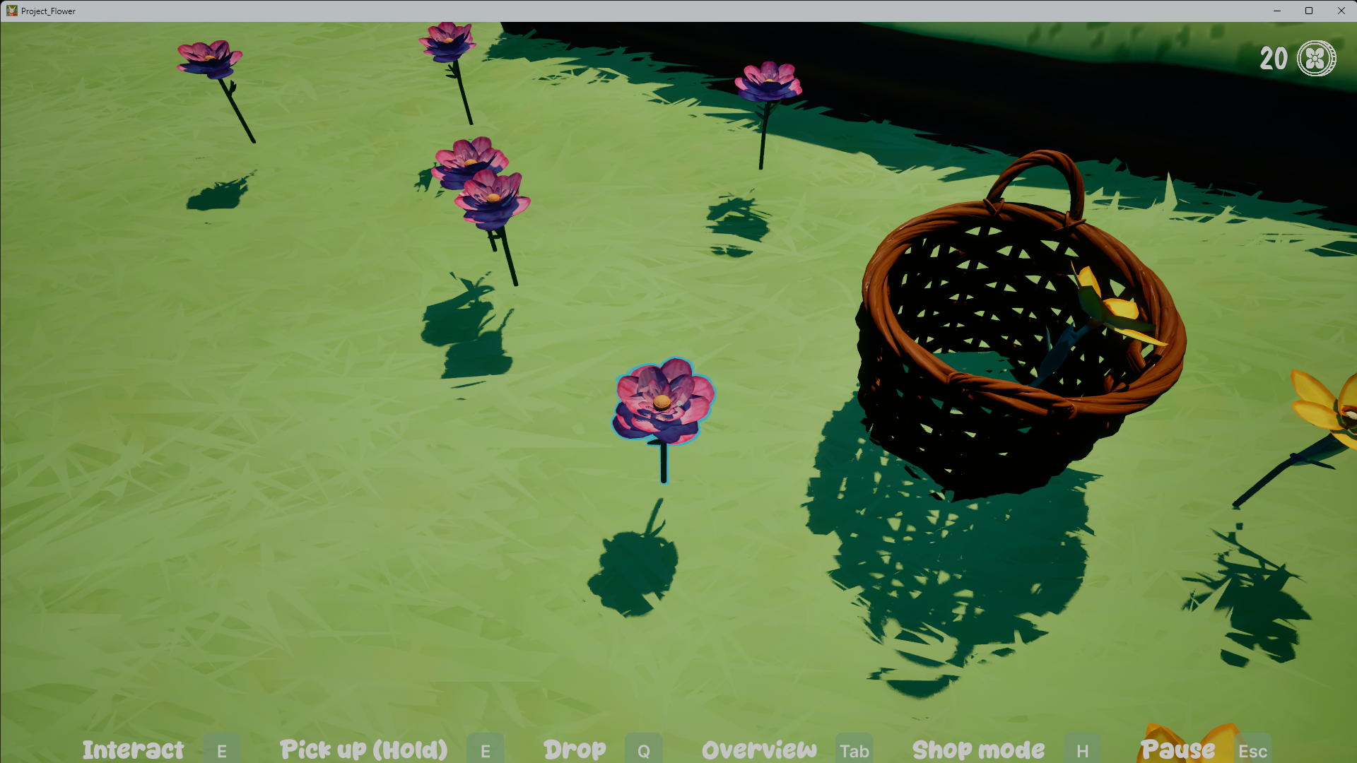
In-Game
Exploration HUD
Wireframe
In-Game
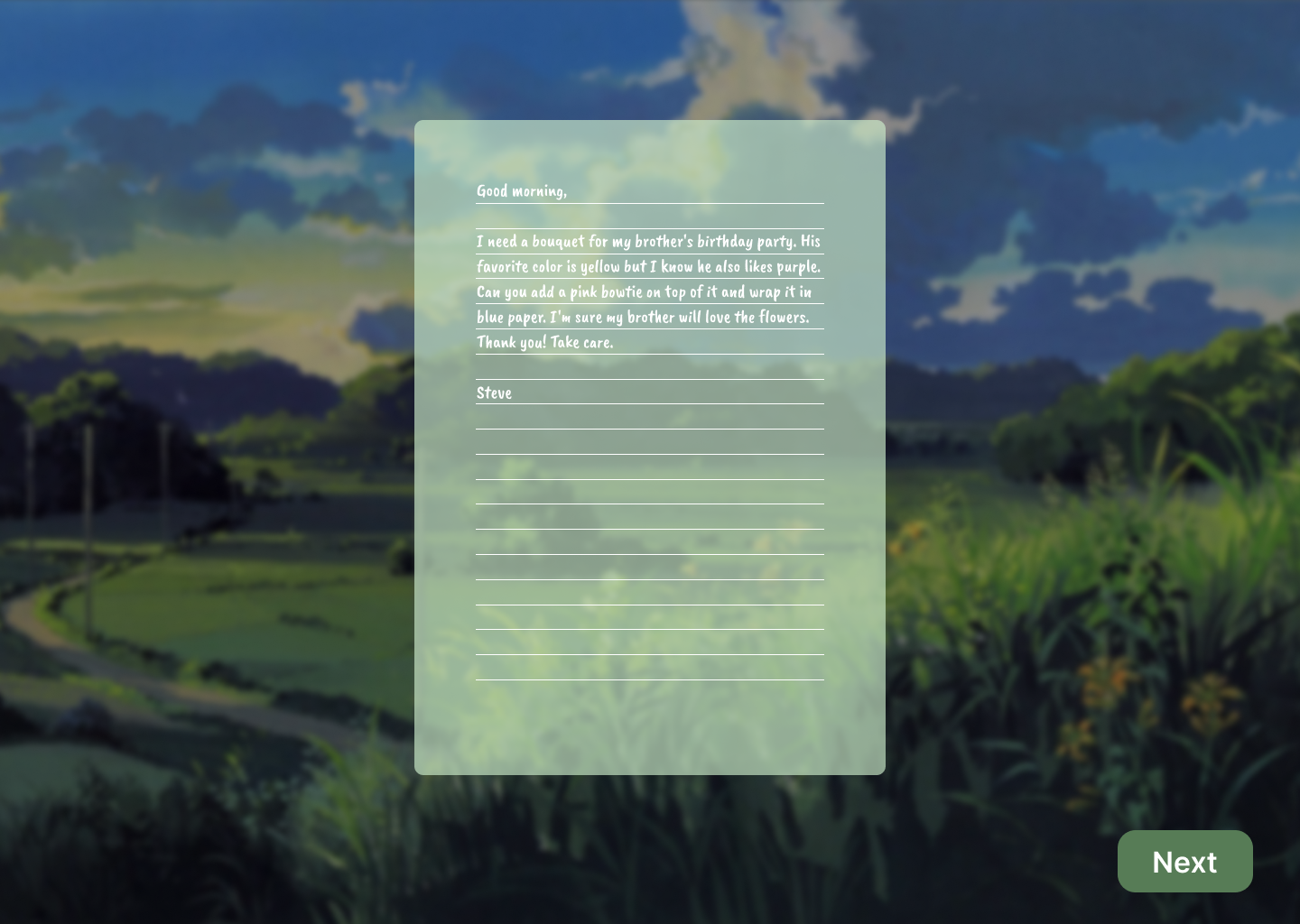
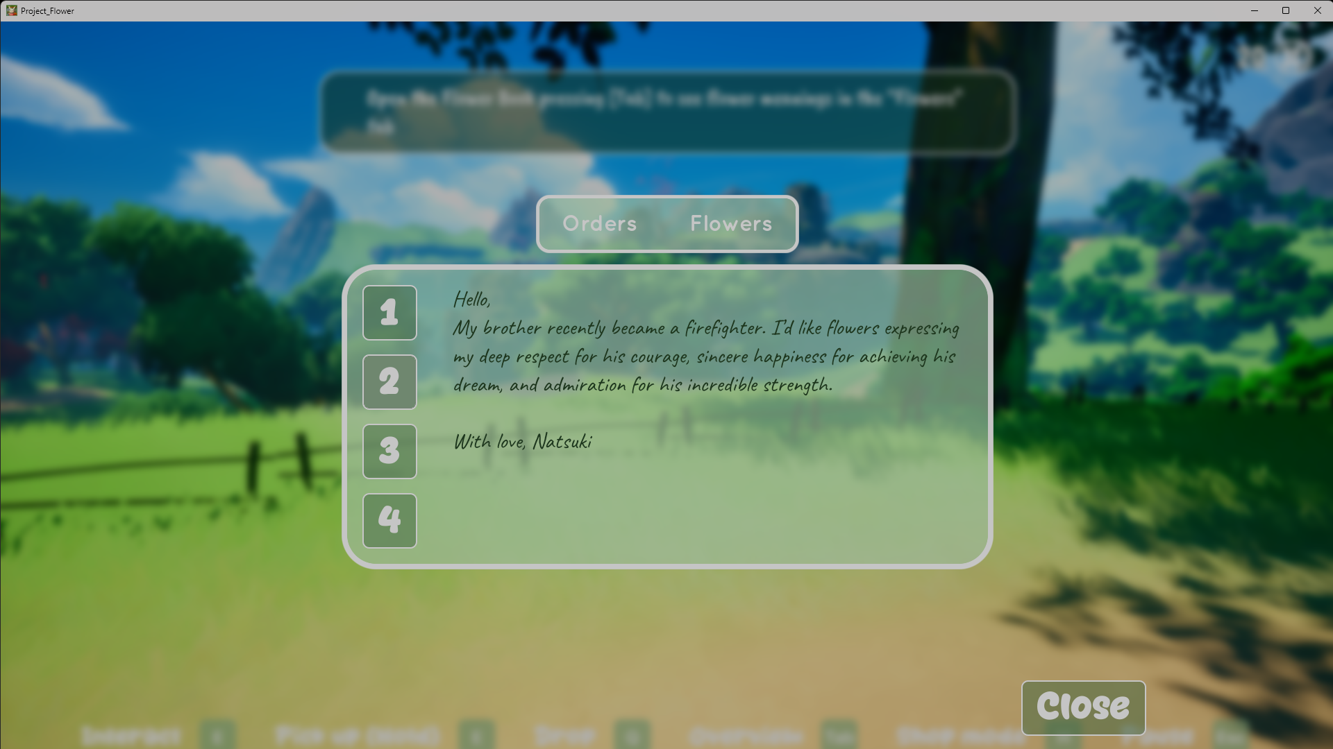
Customer Order Screen
Wireframe
In-Game
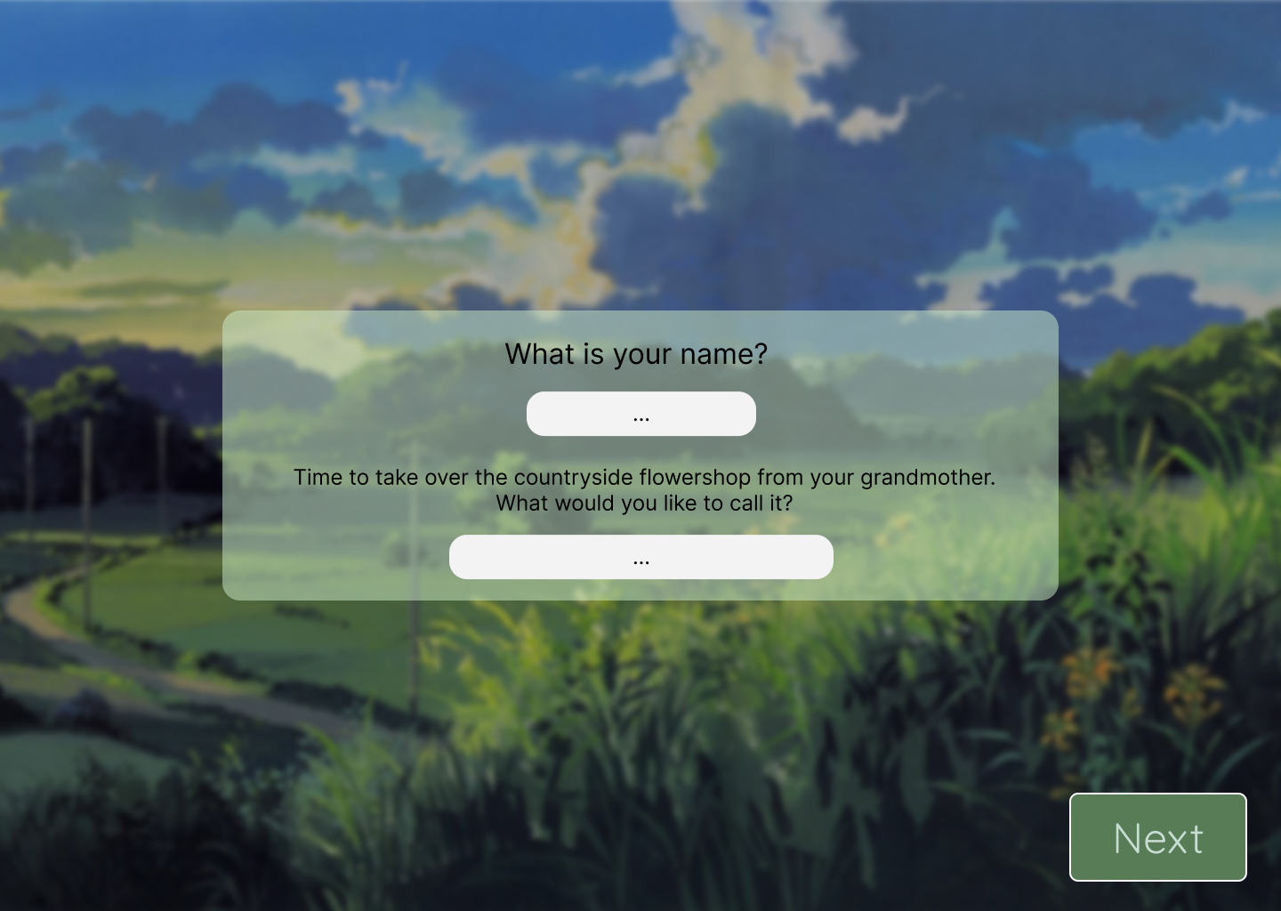
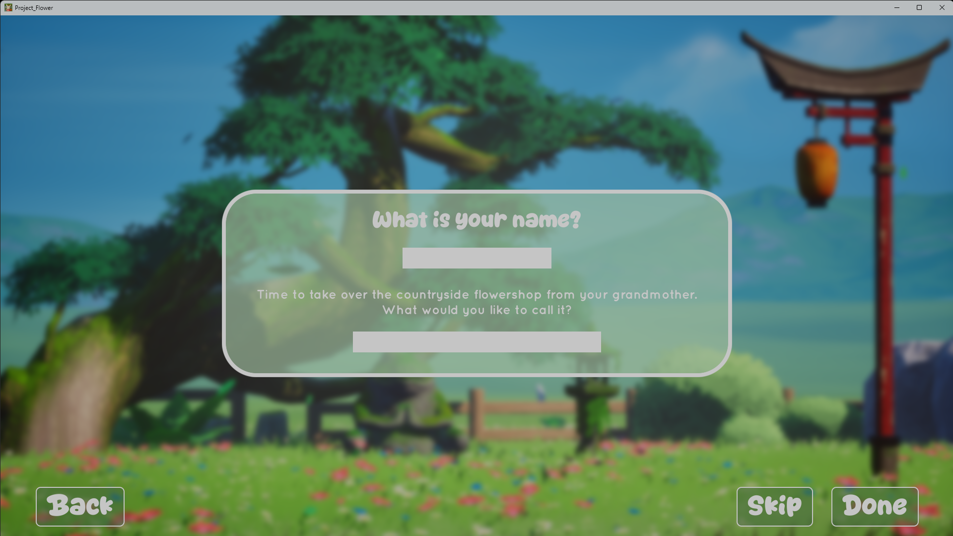
New Game Screen
Wireframe
In-Game
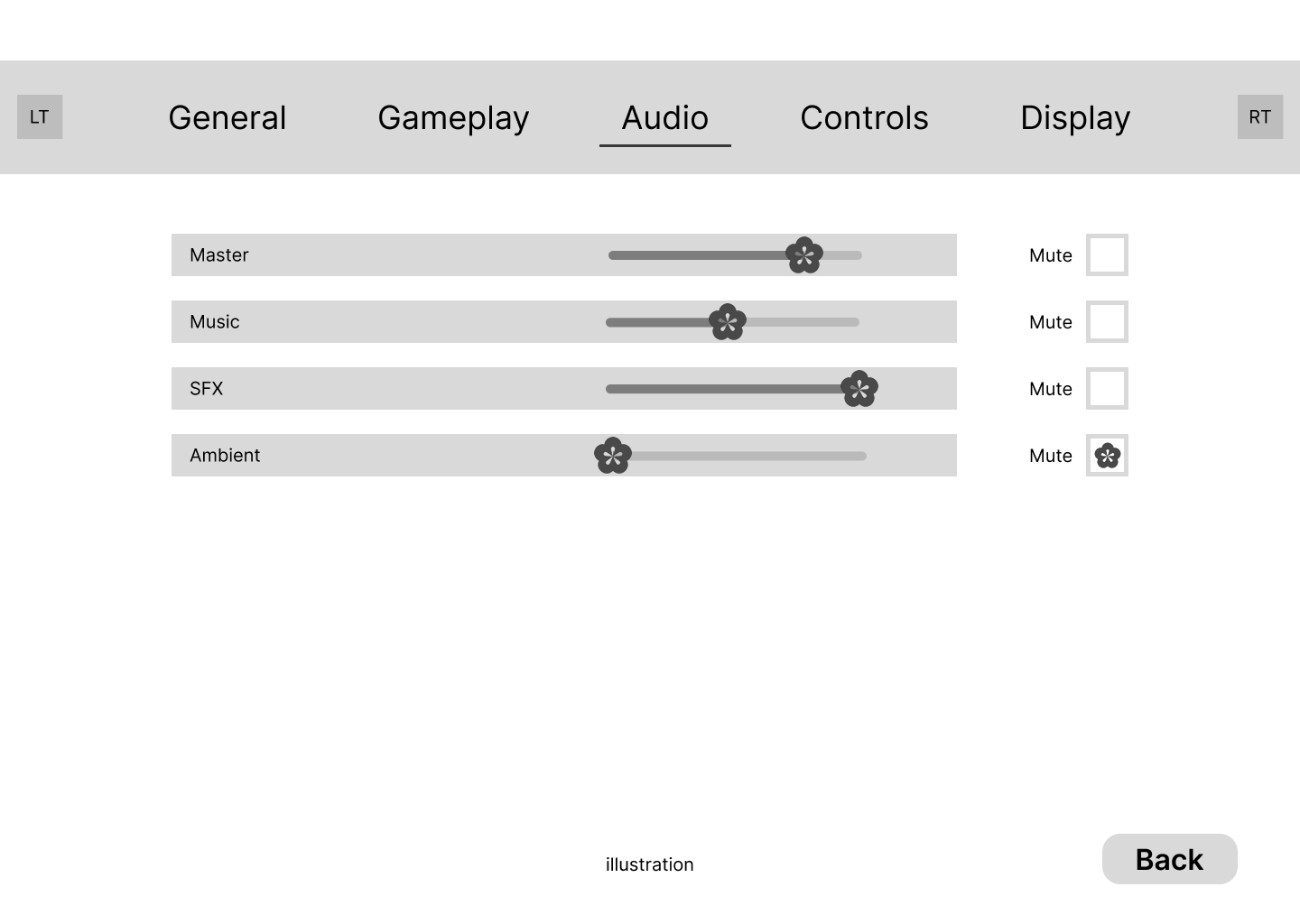
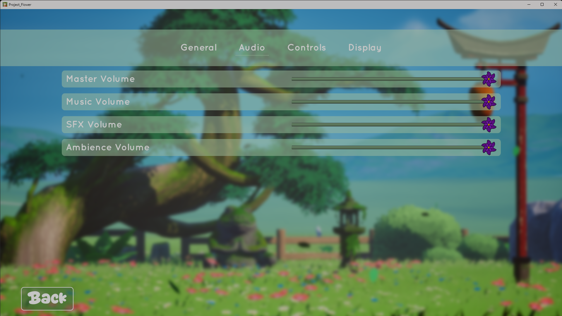
Audio Settings
Wireframe
In-Game
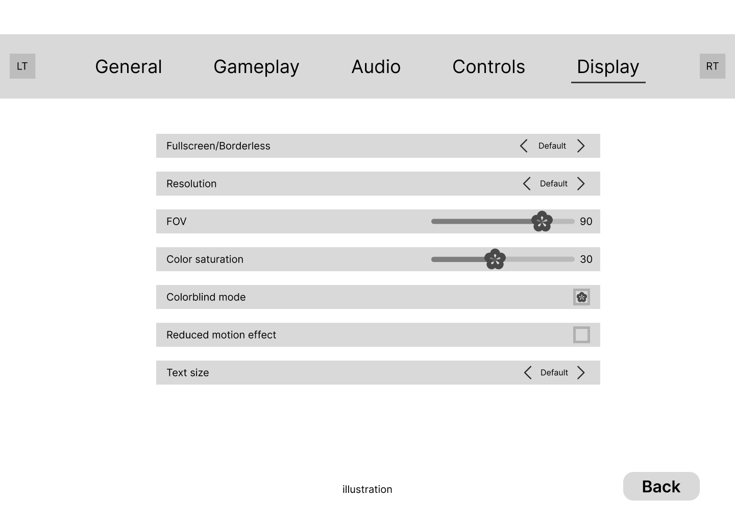
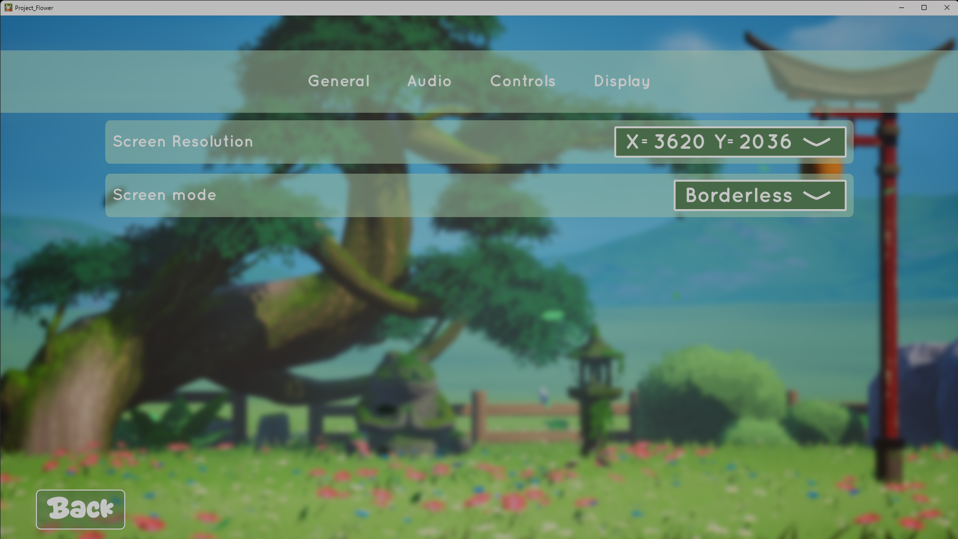
Display Settings
Wireframe
In-Game
General Settings
Wireframe
In-Game
04
Implementation: iteration, alignment, and playtesting under pressure
The gap between a design file and a shipped game isn't just technical: it's coordination, judgment, and iteration under pressure. Motivating every design decision with research and persona was a stated project goal, and it turned out to be the only thing that kept the design coherent when timelines compressed and the team started building in different directions.
Once Perforce access was established, I shifted into systematic triage: daily task lists, consistent check-ins with the programmer, and documenting every decision against Emma and the survey data so the team had a reason, not just an instruction. A significant part of this phase was course-correcting implementation to match the wireframes, pulling screens that had drifted back into alignment and keeping the visual language consistent across everything being built simultaneously.
Playtesting with actual players (school-organised, not perfectly structured, but real) produced the most important finding of the project: players reported feeling relaxed even when confused about what to do, before the tutorial existed. That confirmed the atmosphere hypothesis. Feedback from presentations and ongoing staff critique sessions then shaped the final polish pass.
Playtest results3 participants · post-development
✓
3/3
Would continue playing after the session
Unanimous retention signal. The atmosphere held even when players were uncertain about mechanics.
✓
3/3
Requested a tutorial, unprompted
Team was hesitant to prioritise one. This unanimous signal made it indefensible not to.
Tutorial was built
✓
2/3
Loved the visual style & personality
Ghibli art direction confirmed in-play, matches the 28.6% pre-development excitement signal.
!
Controls
Found unintuitive by playtesters
The control scheme implemented by the programmer diverged from the spec I had submitted. Playtesters flagged controls as the main friction point.
Same root cause as Perforce gap, communication, not intent
Main Menu
New Game Screen
Exploration HUD
Contextual Prompt, Collect Customer Order
Shop Interior
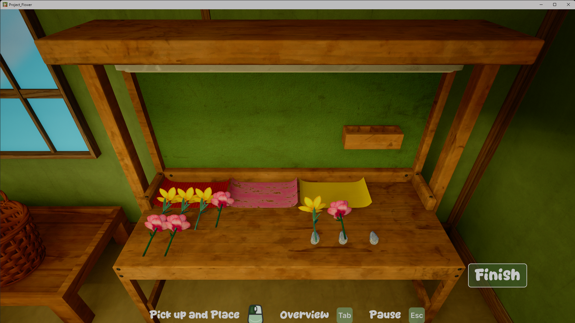
Bouquet Crafting Workbench
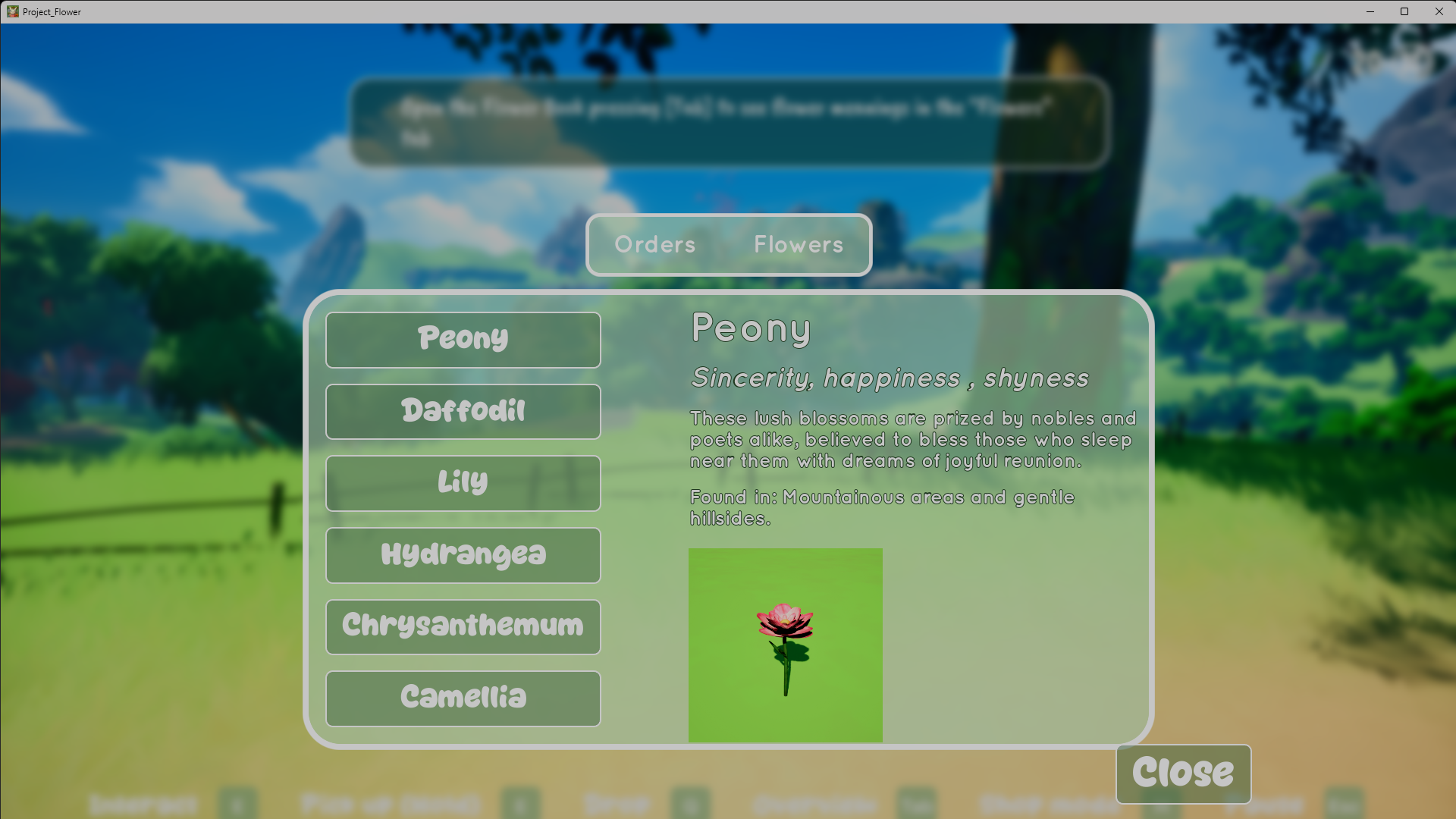
Flower Book, Hanakotoba Guide
Customer Order Screen
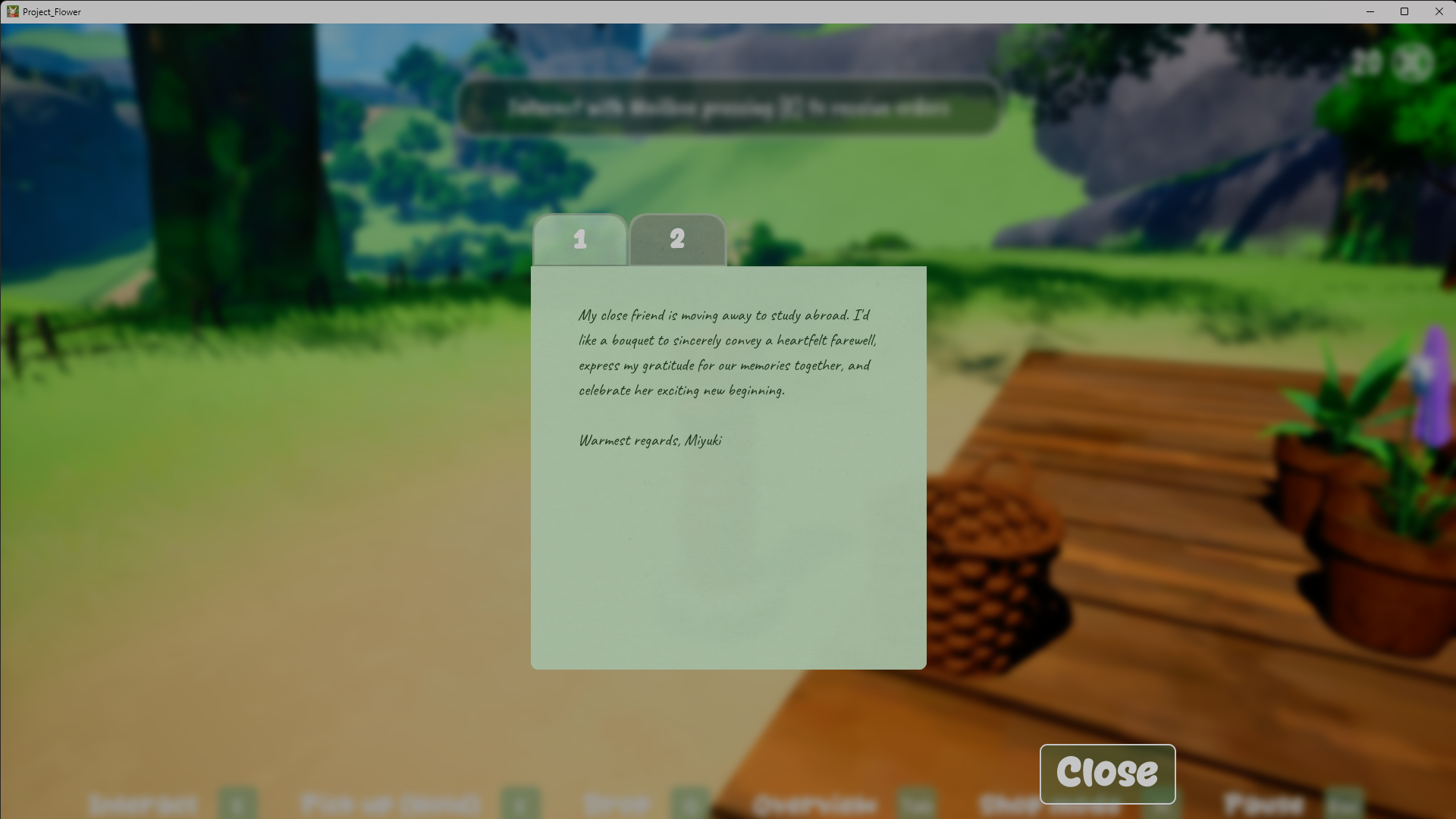
Hanakotoba Letter
Audio Settings
Display Settings
General Settings
Explore the Figma file: tutorial flows & loading screen
Key Decisions
Decision 01
Designed for a researched player, not an assumed one
Why: Before a single wireframe existed, I ran a 42-person survey to define who we were actually building for. The resulting Emma persona (25–30, plays after work to decompress, not competitive, values beauty and optional learning) became the design brief for every decision that followed. 79% cited low-pressure relaxation as their primary goal. 57% said visual art quality mattered. 50% wanted something optional they could actually retain. Without that evidence, every tension in production defaults back to conventional game design conventions, the kind the target player is actively escaping from. The survey data is the reason we replaced the core mechanic mid-project instead of defending it.
Decision 02
Replaced colour memorisation with a Hanakotoba interpretation system
Why: Survey data showed players wanted to learn from their cozy game experience. The original mechanic required memorising a colour sequence from the customer's order letter, then recreating it at the workbench from memory, with no reference visible during crafting and complexity scaling as more colours unlocked. Cognitive load with no payoff of discovery. I also recognised from personal experience with ADHD that pure memorisation creates real accessibility barriers. Replacing it with the Hanakotoba system gave players something genuinely worth learning, Japanese flower language, woven into the world, not bolted on as a test. The jury later called it "the right amount of effort."
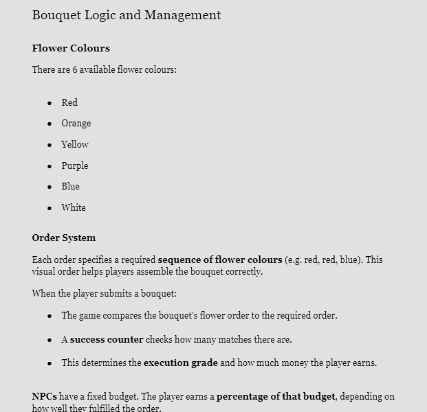
Original Colour Memory Mechanic (from the GDD)
Decision 03
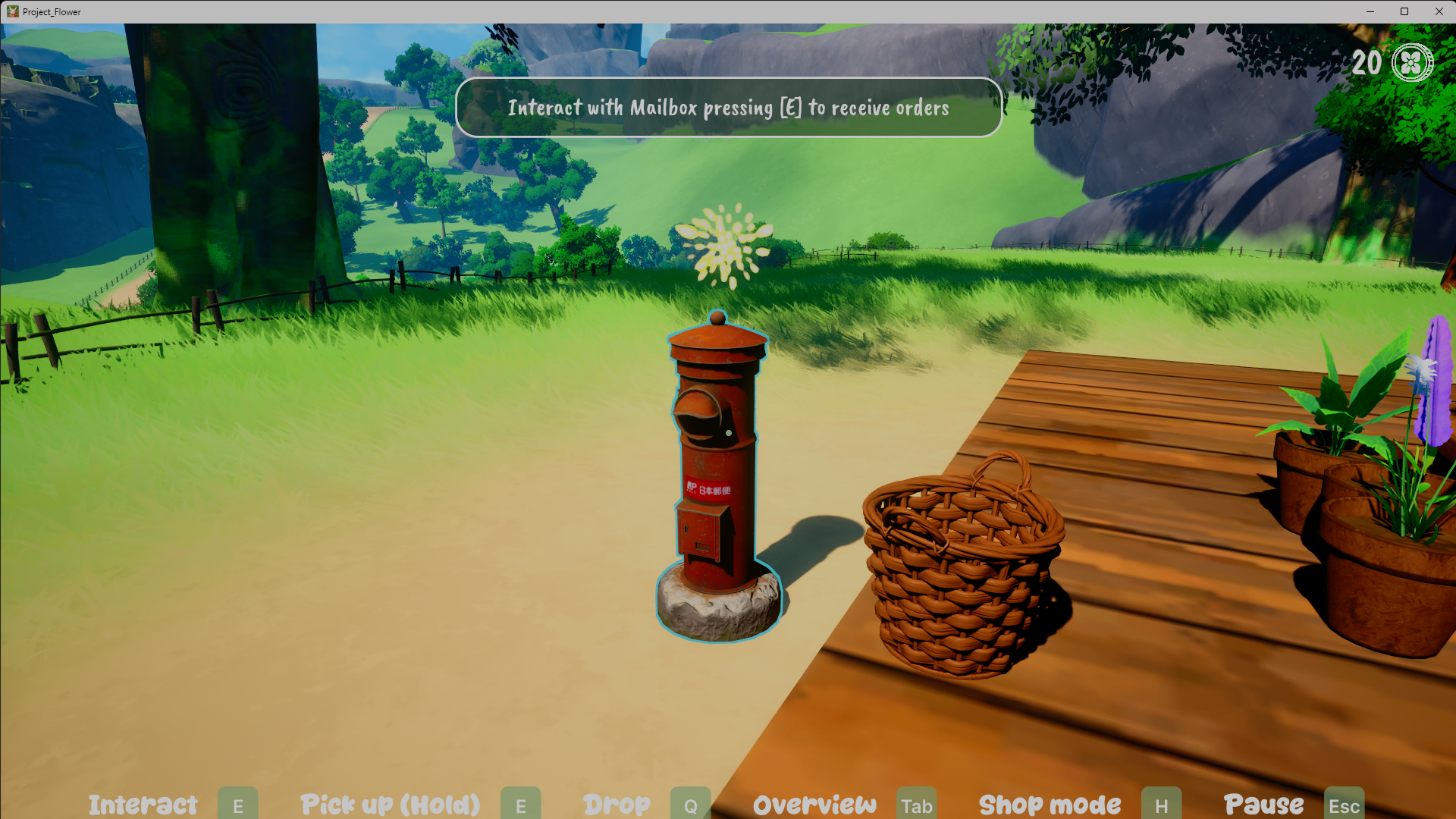
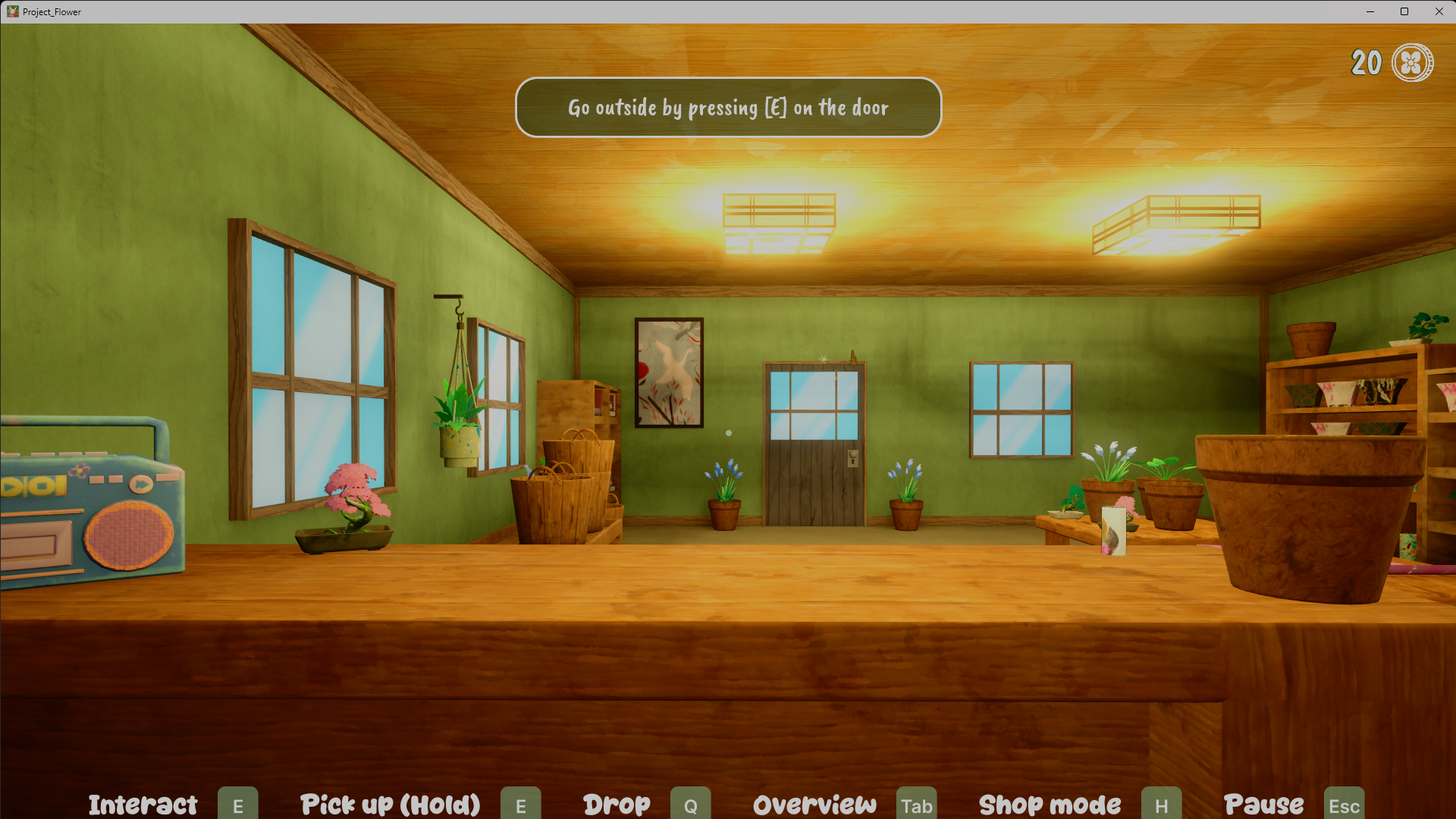
Proximity-based contextual prompts instead of persistent HUD elements
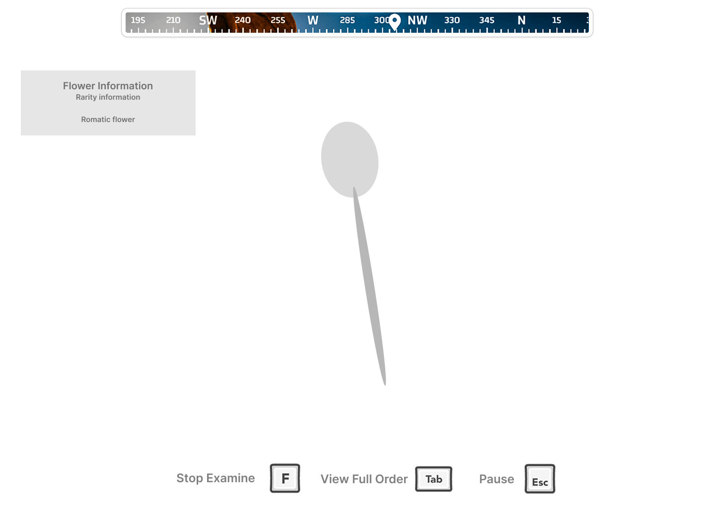
Why: Persistent UI elements break immersion in cozy games. Players should feel like they're in a space, not using software. Europa's approach to contextual prompts showed that information can appear exactly when relevant and disappear otherwise, supporting the atmosphere rather than interrupting it. This system was designed and wireframed but did not make the final build due to implementation complexity. Worth documenting: even as a cut feature, the principle shaped the entire HUD philosophy. Every element that did ship was held to the same standard, appear when needed, disappear otherwise.
Designed wireframe, feature not shipped
Decision 04
Customer orders as heartfelt letters, not a task list
Why: Every cozy game asks you to do something, the question is whether the ask feels like a chore or a privilege. Presenting customer wishes as personal handwritten letters, with the Hanakotoba flower language woven into the customer's own voice rather than displayed as game data, makes the player feel like a trusted craftsperson receiving a genuine request. A clean task UI would have been faster to parse but would have broken the spell. The letter format keeps the mechanic inside the world instead of pulling the player out of it.
Audio & Atmosphere
Designing for a multisensory calm
The relaxed feeling players reported wasn't produced by any single system. It came from music, ambience, pacing, and art working together. Our playtest plan treated this as a formal hypothesis: would players still feel relaxed even when confused about what to do? They did, before the tutorial existed. That told me the atmosphere was carrying the experience, and that the UI's job was to protect that calm rather than compete with it.
Sound wasn't my formal responsibility, but I owned three decisions within it because they were load-bearing for the stress-relief goal, and in one case, because no one else was championing them.
01
Sound effects budget advocacy
Early on, SFX had no designated advocate, and I'd already concluded that a cozy game lives or dies on its small interaction sounds: the pop of picking a flower, paper crinkling around a bouquet, surface-specific footsteps. I argued for keeping SFX in the project budget on the grounds that it was essential to the relaxation target, not a nice-to-have. Same logic as the Hanakotoba pivot and the accessibility settings: identifying something the experience goal depended on and securing it before there was team consensus.
02
UI audio specification
Hover, click, menu-transition, and volume-change sounds are part of how an interface communicates, so I treated them as interaction design, not decoration. I selected the UI sound set and handed the sound designer a placement list mapping each sound to its trigger across the menus and settings, alongside the visual specs for those same screens.
03
Ambience direction
I contributed to the environmental sound direction (which ambient sounds to include and where) so the soundscape reinforced the same unhurried mood the visuals and pacing were setting. The goal was continuity: a player who closed their eyes should still feel like they were in the same world.
A favourite detail
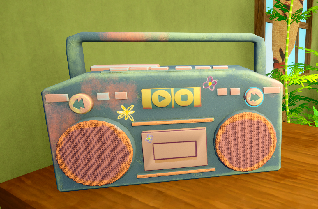
The in-shop radio
The radio is diegetic and fully functional: the player walks up to it and uses its buttons to switch between stations, each with its own vibe: a city pop track, a synthwave song with Japanese vocals, a lo-fi channel. Turning it on quiets the gameplay score so the radio takes over, and because the audio is anchored to the shop rather than the player, it fades out naturally when you step back outside, the way a real radio left playing on a counter would. It's a small system, but it does a lot of cozy work: it hands the player a low-stakes choice over their own atmosphere, which is exactly the kind of unpressured, self-directed control the whole game was built around.
Music and original compositions were the work of Frida Thomander, Erik Emanuelsson, and Kevin Jensen, who earned the team a Best Audio nomination at the Future Games Awards. My role was adjacent and narrower: making sure the audio that served the interface and the experience goal was scoped, specified, and protected.
Results & Impact
A non-distracting interface in a cozy world, jury-recognised for nailing the relaxation-effort balance.
The game was presented to an industry jury at final review, who cited "perfect effort-relaxation balance and strong market potential in the cozy gaming space." Playtesting validated the atmosphere-first approach: players reported feeling relaxed even when uncertain about mechanics, which was the intended priority. The Hanakotoba system, the most contested design decision during production, was specifically called out as "the right amount of effort." Despite solo UX responsibilities, difficult early team dynamics, and technical constraints from delayed Perforce access, the project delivered a cohesive experience across all main screens.
42
Survey participants who shaped the design direction
79%
Cited relaxing, low-pressure gameplay as their top priority
85%
Said story was somewhat or very important
3/3
Playtesters would continue playing after the session
15
Person multidisciplinary team
Solo
UX/UI responsibility across all screens and systems
"Perfect effort-relaxation balance and strong market potential in the cozy gaming space."
Game Project 3, Final Jury Review
Reflection
What went well
Starting with a 42-person survey before touching any wireframes meant I had data when I needed it most, when arguing for changing the core bouquet mechanic mid-project. Without that evidence, it's just opinion. With it, it's a design decision. The research investment at week one paid off every time a design choice was challenged later.
What I'd do differently
I'd establish a communication rhythm with the programmer in week one rather than letting passive documentation do the work. I assumed that well-made Miro boards were enough; they weren't. The two weeks of misaligned implementation were largely preventable if I'd built in regular check-ins from the start rather than waiting for problems to surface.
Something unexpected
The strongest validation came from feedback I didn't expect: players who were confused still felt relaxed. I had assumed clarity was a prerequisite for calm, that players would feel anxious if they didn't know what to do. The atmosphere held even through confusion. That reframed my understanding of what "good UI" means in a cozy game: it's not just clear, it's forgiving.