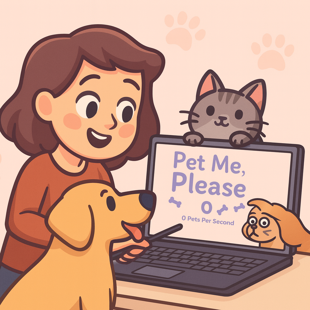
Designing and shipping a complete idle clicker game, built solo in Unreal Engine 5, from first wireframe to distributable .exe in five weeks.
The result exceeded all expectations: playtest feedback included multiple encouraging words and several requests to continue development and release the game commercially.
In an idle clicker, the UI is the game. There's no level design to hide behind, no narrative to carry the atmosphere. If the interface doesn't feel good to interact with, nothing does.
The genre was a deliberate choice, picked specifically because it removes every usual design hiding place. Every screen, layout decision, and interaction pattern had to stand on its own merits. The project also ran double duty as both the graduation project and the programming assignment, both completed in parallel over five weeks, neither cut short for the other, while managing 25% sick leave throughout.
Building a 2D game in Unreal Engine prompted more than a few puzzled looks from classmates. The choice was deliberate: Blueprints came significantly more naturally than writing code, which meant full independence throughout the project: no pair programming, no needing help on the logic. In a solo graduation project, that independence was the point.
Committing to the full design before opening the engine meant implementation was translation, not invention. Every layout decision (hierarchy, spacing, component structure) was made once, not renegotiated every time an element was placed in the engine.
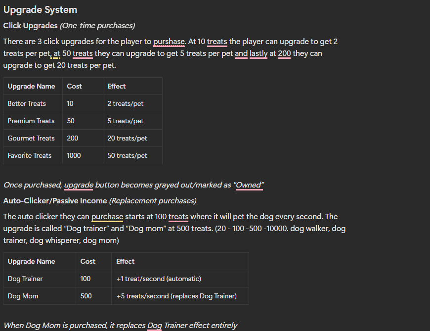
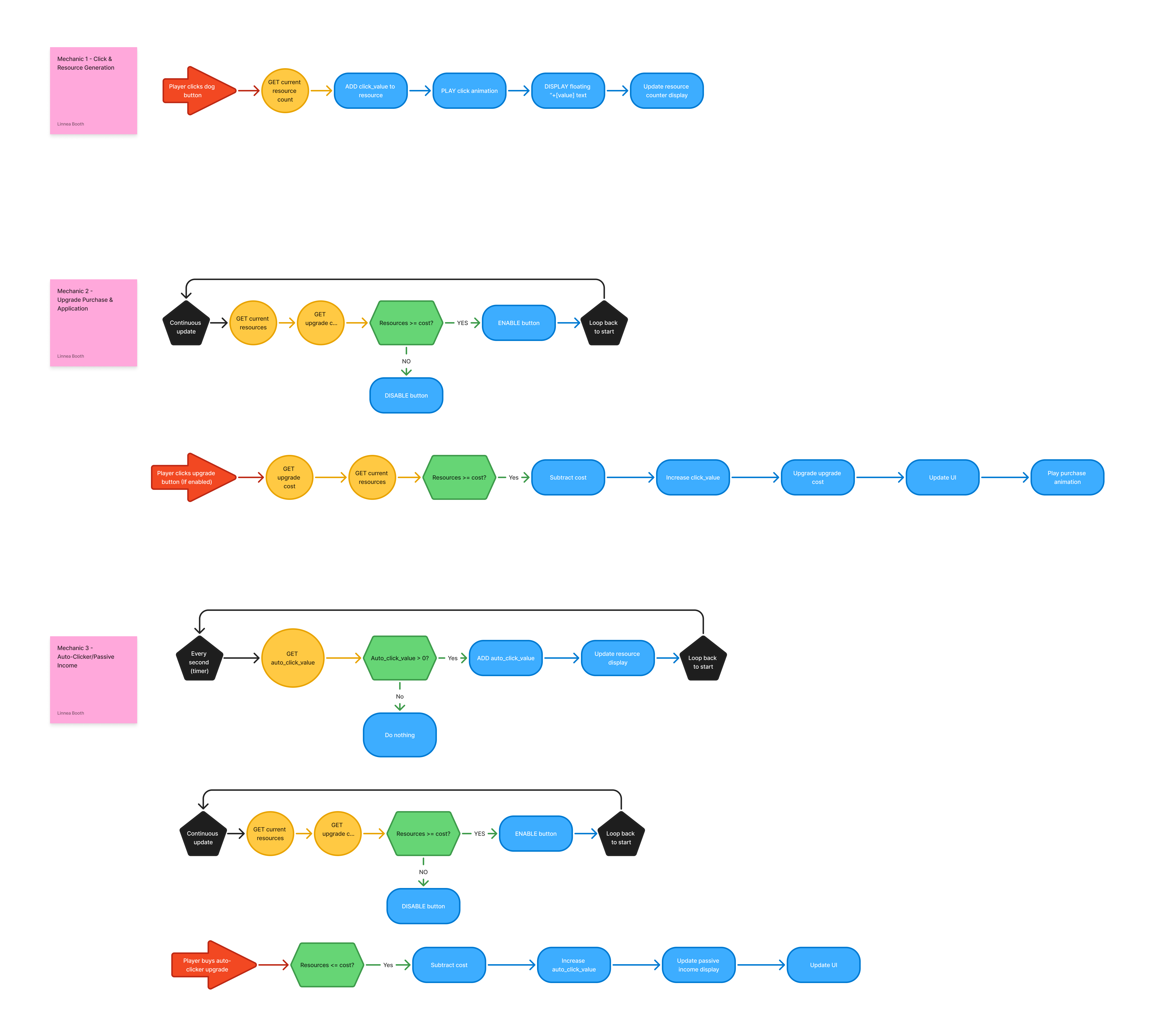
Before opening Figma, the core loops were mapped out in pseudocode and flowcharts: click-to-treat, upgrade purchase, auto-clicker passive income. The GDD and TDD were produced this week too. Having both written first meant the wireframes were built around known behaviour, not guesswork, and each following week had a clear reference rather than ongoing decisions about what to build.
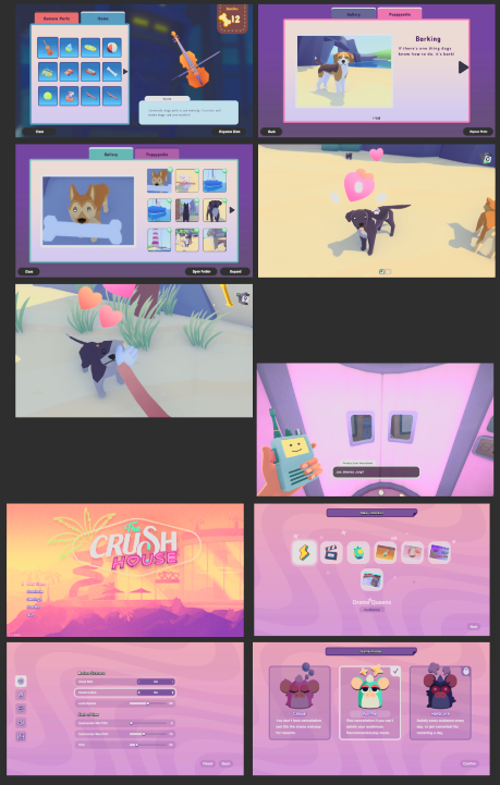
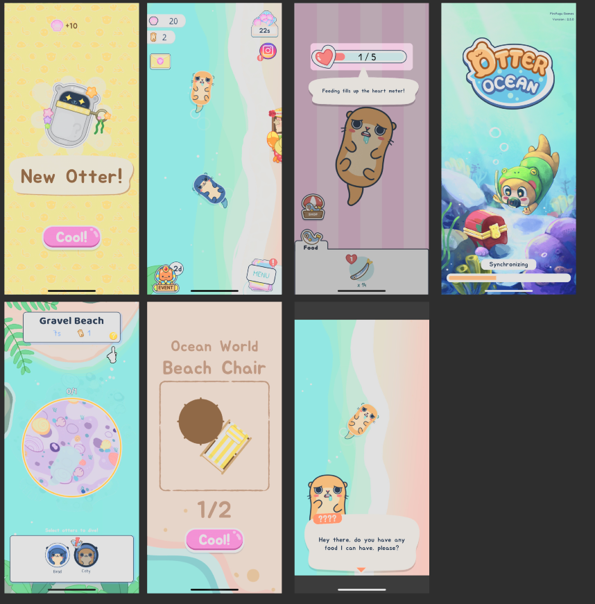
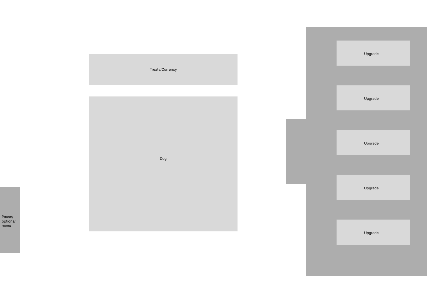
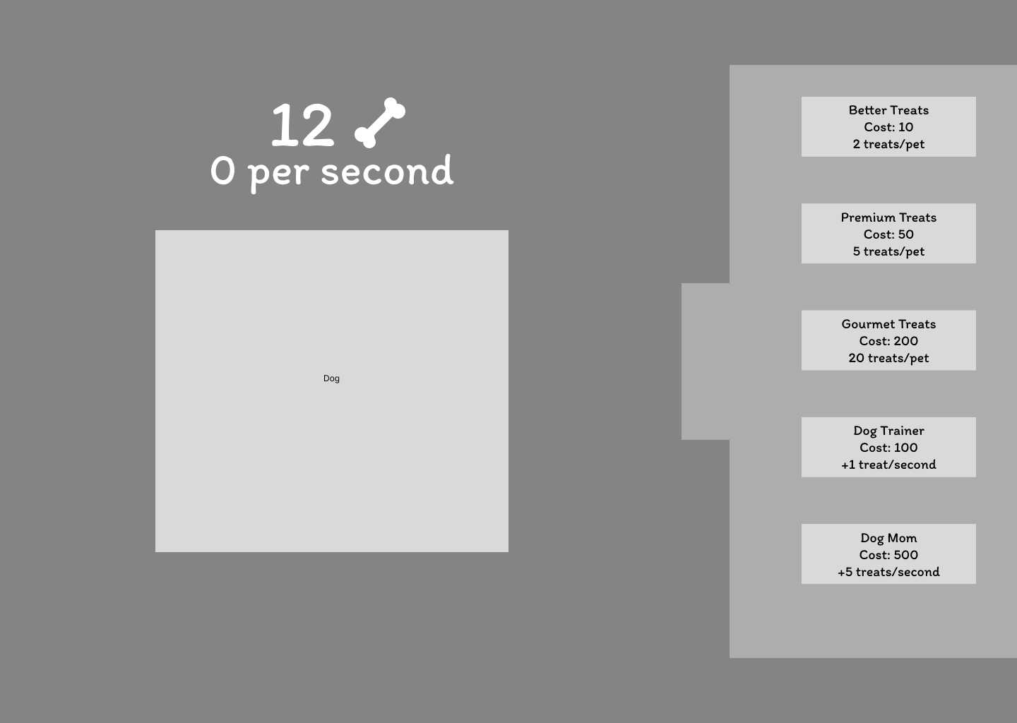
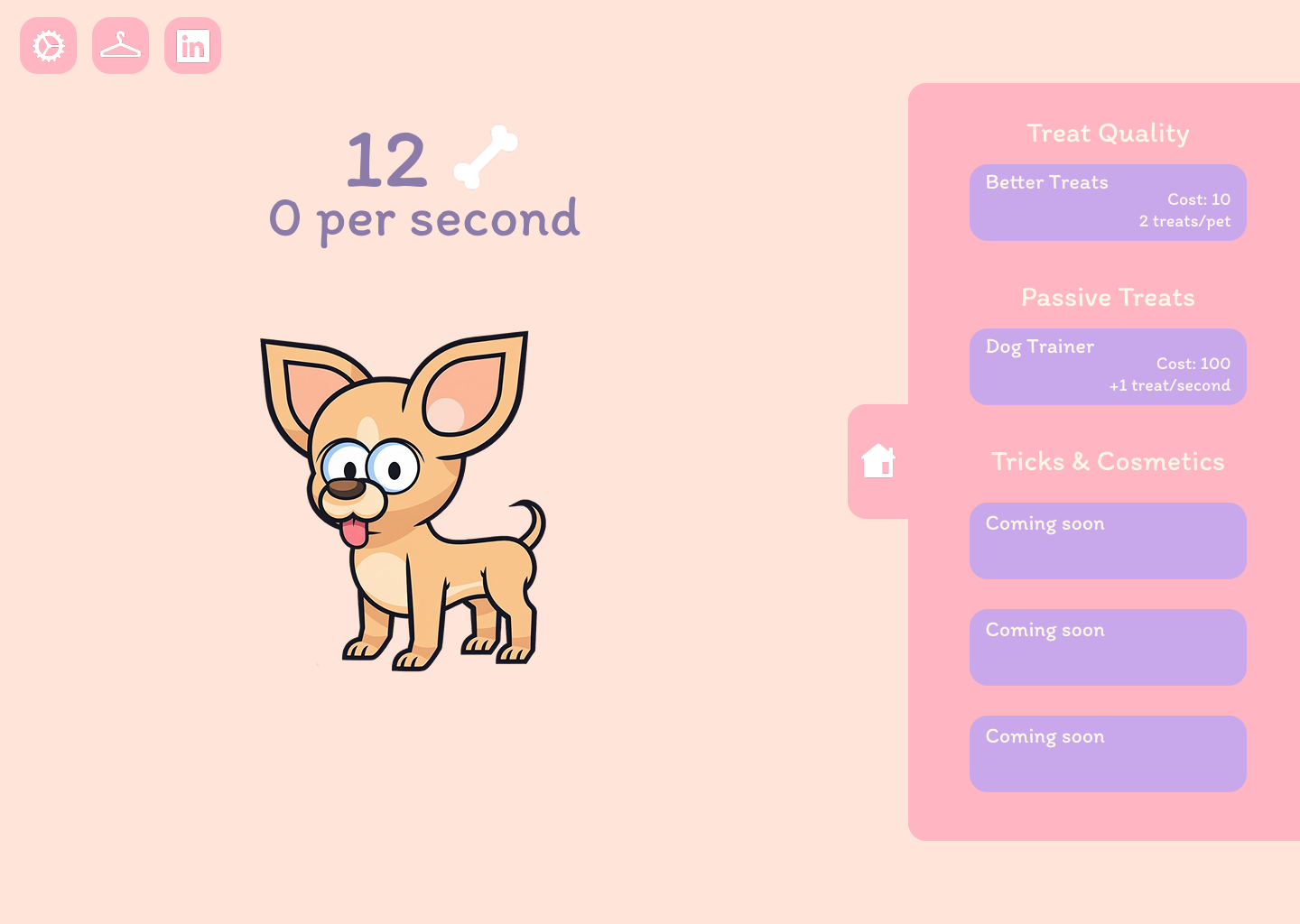
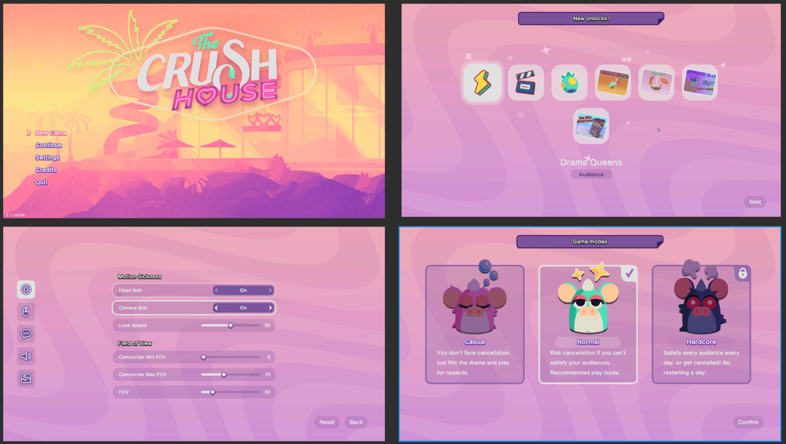
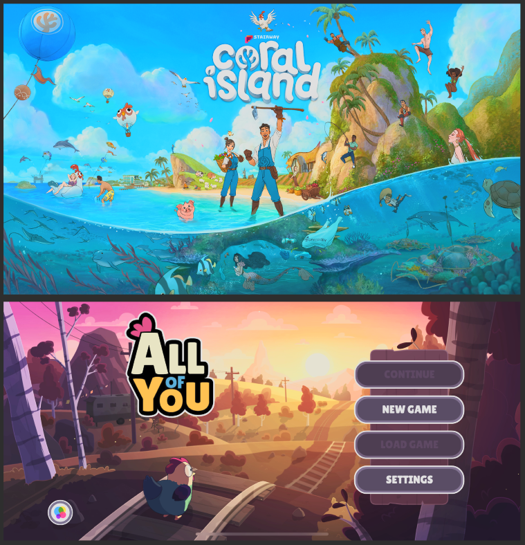
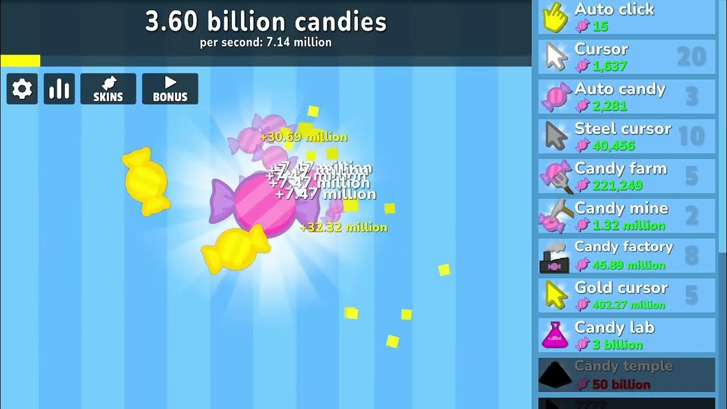
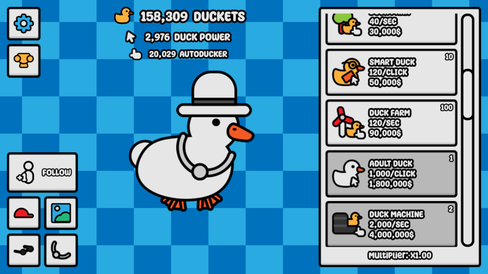
Then into Figma: low-fidelity greybox for layout logic and hierarchy only, then an improved lo-fi pass, then final wireframes with the complete colour palette, typography, and component structure locked in. Visual direction came from Animal Party, Otter Ocean, Pupperazzi, and Coral Island, cozy but not childish, soft enough to feel approachable, clean enough to feel considered. Peach background, pastel pink shop panel, lavender for locked and coming-soon states. A single rounded sans-serif throughout, with weight doing the hierarchy work rather than mixing typefaces. Gameplay references from existing idle clickers informed the pacing logic and upgrade feel before any UE5 work began.

Lo-Fi Draft
Improved Lo-Fi
Style Research
Gameplay Research & References
Separating "make it work" from "make it look right" meant the logic was stable before the visuals arrived. Debugging Blueprint and reworking layouts at the same time would have been slower and produced worse results on both dimensions.
Grey placeholder buttons: the dog was initially just a large clickable button. Swapping in the sprite early was a personal call: having a character there made it much easier to reason about what feedback should happen on each pet. A treat counter that incremented, 2–3 upgrade levels, floating "+1" feedback. Ugly, functional, and essential. Getting a working build early also created buffer time that turned out to be needed when sick leave started eating into available weeks.
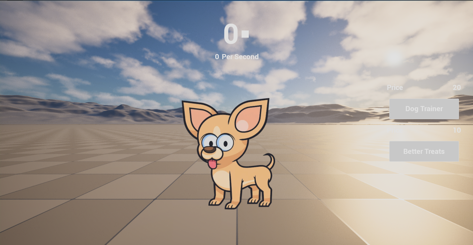
First ImplementationDog illustration: Hand drawn cartoon chihuahua by @freepik (freepik.com)
Because the Figma work in Week 1 was thorough, visual implementation in Week 3 was mechanical. The wireframes were the spec; the engine work was execution. That's a much better place to be than making design decisions inside the engine.
The start screen, custom buttons, correct padding and spacing, typography matching the design system, the treat counter in its final position above the dog. The shop doesn't have to be always visible; a dedicated shop button toggles it, so the dog and the core game view stay in focus. Every screen maps directly to a Figma frame from Week 1.
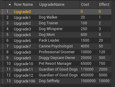
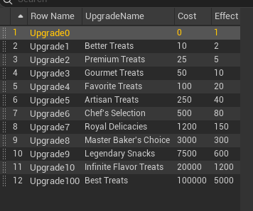
Three hardcoded upgrade levels wouldn't create the "almost infinite loop" feeling that keeps players engaged. Learning Data Tables mid-production was steep at the start of the week and obvious by the end: 13 passive upgrades and 12 click upgrades, all driven by a single table, values tunable without touching Blueprint logic.
Brought the game to Indie Game Night and watched real players interact with it. Two things came out of it. The floating "+treat" text was intercepting mouse input: players would click the dog, the text spawned directly under the cursor, and the next click registered on the text instead of the dog. Ten minutes to fix once the issue was clearly seen. The second was the Quality Upgrade Reset Bug: discovered during the session, backlogged with a clear fix noted.
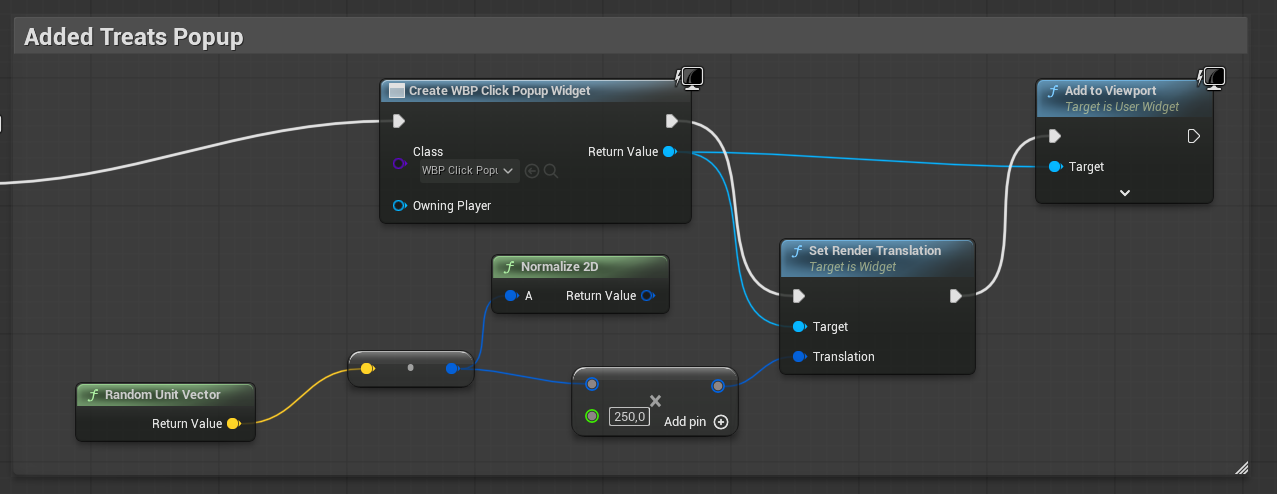
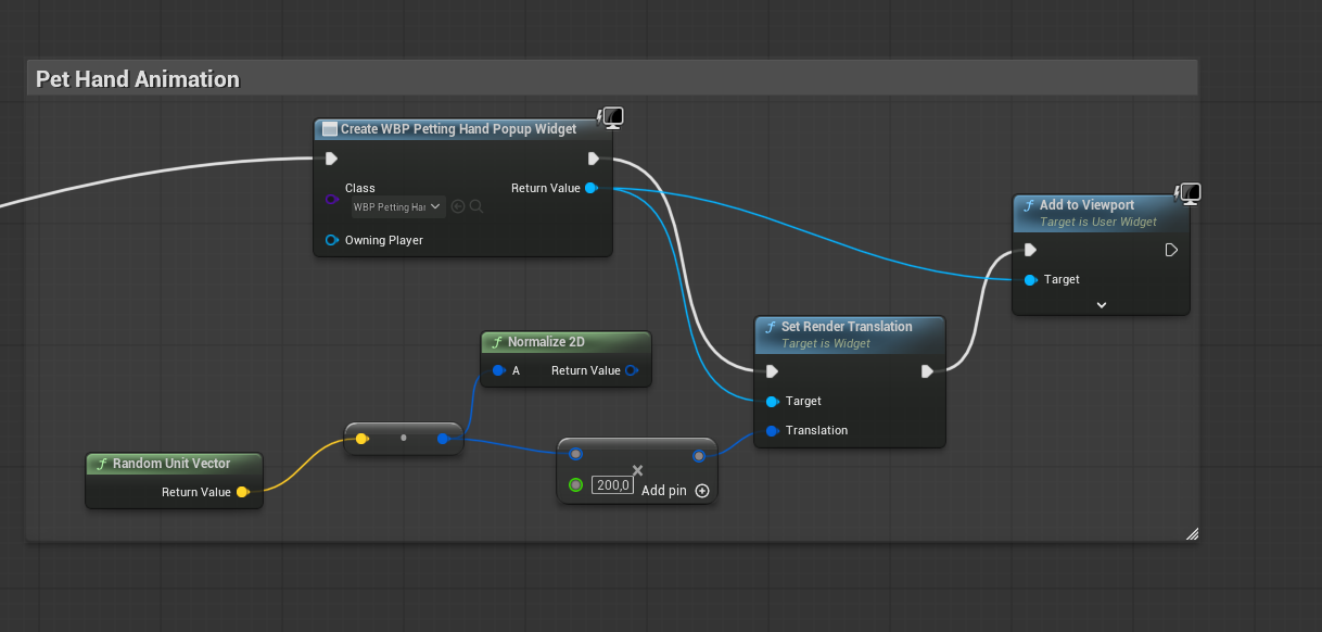
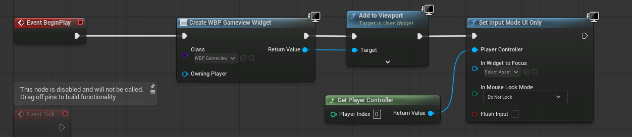
The floating text fix (making the popup non-hit-testable in Blueprint) was ten minutes of work once the issue was clearly visible. The four-layer feedback response (counter, scale pulse, SFX, particles) was wired simultaneously in a single Blueprint event. A UI-only mode Blueprint was also required to get the Niagara particle effects rendering correctly within the UI layer.
Passive Upgrades
Treat Popup BP
A distributable .exe is a different kind of portfolio artifact than a video of a playable build. Packaging wasn't required by the brief: it was a self-imposed challenge, and worth doing for exactly that reason.
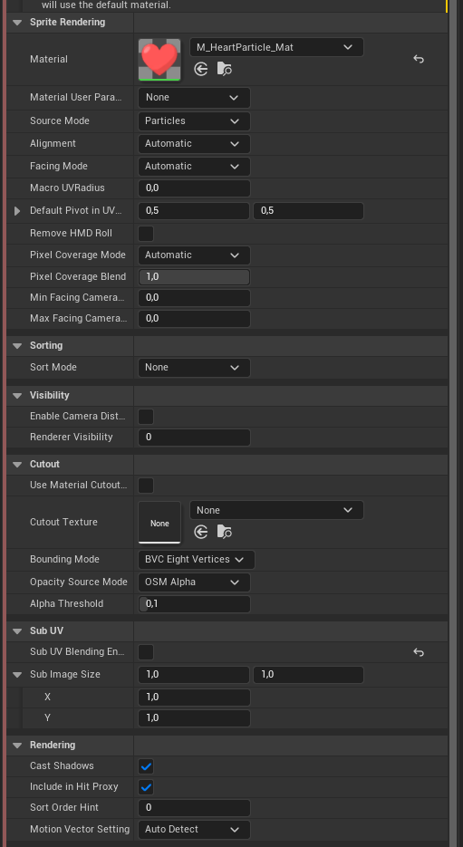
Final additions: Niagara heart particle effects triggered on each pet (first real Niagara use, requiring exploration of the VFX-to-UI plugin), shop popup slide-in animation, disabled button states for unaffordable upgrades, and a LinkedIn icon linked directly to the profile. Each click triggers four simultaneous feedback responses: a floating "+X" counter, a scale pulse on the dog, a cat purr SFX, and Niagara particle hearts. Every layer intentional.
Packaging took approximately seven hours of troubleshooting, three or four Unreal reinstalls, and mentor help for the Niagara plugin installation. GitHub made the whole process survivable: trying aggressive fixes without fear of losing working code is the difference between problem-solving and gambling.
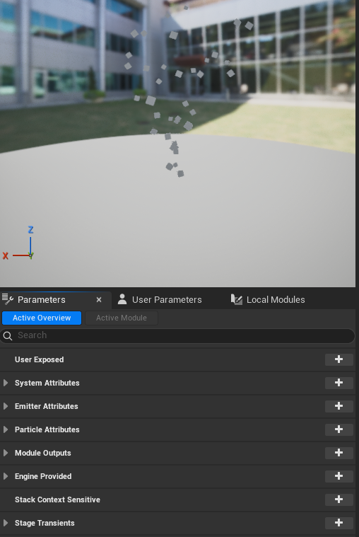
Niagara Plugin
Why: Each stage had one job. The greybox was for structure, not aesthetics. The final pass was for aesthetics, not structure. Mixing those concerns earlier would have slowed everything down and produced worse results on both dimensions. By Week 3, visual implementation was purely mechanical: every decision had already been made in Week 1.
Why: Players always need to know where they are in the loop: the core feedback (pet → treats) and the spend opportunity (shop panel) both need to be in frame simultaneously. Losing either would have broken the rhythm that defines the idle genre. Context maintenance isn't a UX nicety; it's a game mechanic.
Why: Unaffordable upgrades stay visible and in place, just rendered distinct rather than hidden. Players can see what they're working toward without having to discover it first. The coming-soon locked states in Tricks & Cosmetics do the same: they communicate genuine future potential rather than empty space. Visibility drives motivation; hiding options removes it.
Why: Any UI element that exists purely as feedback should never intercept the interaction that triggered it. A direct result of watching real players at Indie Game Night: the floating "+treat" text was spawning under the cursor and eating subsequent clicks. Knowing the issue existed was not the same as understanding the friction it caused. Watching someone sit there clicking and nothing happening made that difference concrete.
Both deliverables (the graduation project and the programming assignment) completed in parallel without cutting either short. The live playtest produced a real UX fix, not just a list of feedback. A distributable .exe shipped to an actual audience, not just a demo video. 25 upgrades driven by a single Data Table that took four days to learn and immediately paid off.
"This project ended up being so good I think you even exceeded your own expectations a bit. You managed to create and release an entire game in four weeks basically, and achieved all your 'nice to have goals' along the way as well. I am extremely impressed with both your game design skills, as well the UI and UX and technical skills you showcased for this project, and it deserves nothing less than a VG. Well done!"
Leo Alkberg, Course Leader & Mentor, Futuregames UXD24 Graduation Project
Presentation mockup: AI-generated with Microsoft Copilot.
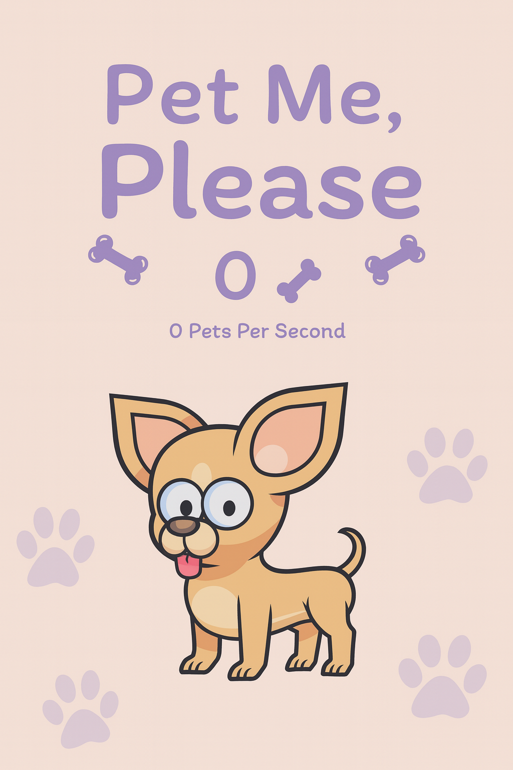
Graduation project release poster
The three-stage Figma process paid for itself in Week 3: visual implementation was execution, not decision-making, because every decision had already been made in Week 1. Getting functional code running early created buffer time that absorbed the sick leave impact without sacrificing either deliverable. Choosing the idle clicker genre deliberately, for its UX demands, turned out to be exactly the right difficulty level to close the course with. The packaging challenge was self-imposed, unnecessary, and worth doing.
Add the save system back. Not because it's technically complex, but because its absence changes the player relationship to the game. An idle clicker without persistence is missing part of its identity. The Quality Upgrade Reset Bug would also be fixed before shipping. Both were the right scope calls given the five-week timeline. Both undercut parts of an otherwise clean experience. The playtest also taught something harder to fix next time: the gap between knowing an issue exists and understanding the friction it causes for someone encountering the product for the first time.
I was asked multiple times why I used a cat purr as the SFX when petting the dog. It stirred up more controversy than I expected. The answer: not all dogs make noise when being pet, but a cat purring is immediately recognisable as an animal enjoying something. It somehow replicates the feeling I get when petting my own dog and seeing how happy it makes them. Hearing it while testing made me happy inside every single time, which felt like exactly the right signal that the feedback loop was working.