← Back to Works
Course Project: Gamification & Fitness App UX

WristCheck

Transforming a wrist rehabilitation tracker into a motivating recovery experience through gamification, without distorting the clinical signal.

UX/UI Gamification Fitness App Art Direction View on Creative Crowd ↗
Figma Miro Trello
2024Year
3 wksTimeline
7Team
UX/UI + Art DirRole
Overview
A 7-person UX student team assigned to gamify one component of a wrist rehab tracker — we redesigned the whole app. I owned the PRWE pain-scale form, post-exercise evaluations, progression system, and graphic profile.

Clinicians called it "genuinely engaging." The water metaphor was specifically praised by physicians in the room.

Challenges
Clinical accuracy was non-negotiable: any design introducing response bias would be worse than the original form. On top of that, the project straddled Christmas break: 1.5 weeks before, 1.5 weeks after. The momentum loss between halves meant the real work compressed into less time than planned.
Learnings
Research before designing: understanding what each PRWE question clinically measures made every decision defensible, not aesthetic. Clear team ownership from day one matters more than expected.
Tools
Figma Miro Trello
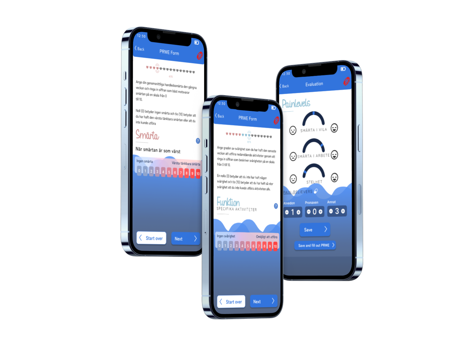
WristCheck — three-screen mockup showing the gamified PRWE rehabilitation app
The Challenge

Patients were abandoning wrist rehabilitation tracking mid-recovery. The PRWE form, the clinician's primary tool for measuring progress, was so dry they stopped completing it.

Without consistent form completion, clinicians lose the data needed to adjust treatment plans. Patients lose a feedback loop that could motivate continued rehabilitation effort. The gap between clinical accuracy and patient engagement wasn't just a usability problem; it was actively harming outcomes. A form that goes uncompleted is the same as no form at all, no matter how clinically validated it is.

Process
01

Identifying the Patient Problem and Choosing to Own It

When the team divided up the app's screens, taking the PRWE form wasn't assigned; I chose it. The completion data was clear: patients weren't finishing the form, and incomplete answers meant clinicians couldn't accurately track recovery. No amount of gamification on top of the app would matter if the core data-collection experience was broken enough that people gave up mid-way.

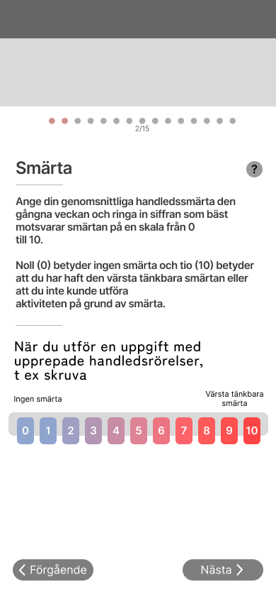
The PRWE (Patient-Rated Wrist Evaluation) is a validated 15-item clinical questionnaire measuring wrist pain and function, the primary tool clinicians at Linköping used to track patient progress across two domains: pain intensity and activity difficulty. Before redesigning anything I needed to understand what each question was clinically measuring, because any change that altered what was actually being asked or introduced response bias would produce worse outcomes than the original broken form. That constraint defined the scope: the interface, the pacing, and the feedback were all fair game. What the form measured was not.

Source document
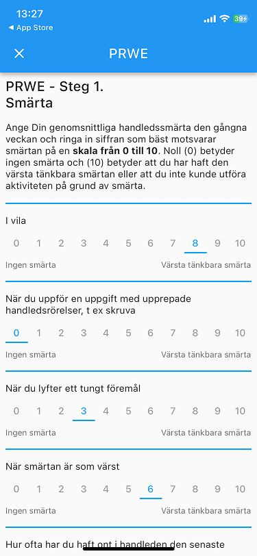
Original app format
PRWE form — original app format before the redesign
WristCheck wireframe
WristCheck — wireframe of the redesigned one-question-per-page format
02

Form Psychology Research

Before touching Figma, I read about form psychology: the cognitive and emotional reasons people stop filling things out halfway through, and how length perception, visible progress, and interaction rhythm affect completion. Part of the framing also came from my own experience with medical forms: they feel like a chore, and I've left them half-finished. I wanted to make this one feel like something you could get through without it feeling like that.

The same root cause came up across everything I read: cognitive overload from too much information on screen at once. When multiple questions are visible simultaneously, working memory splits between parsing which question to answer, tracking which have been completed, and deciding whether to proceed in order. None of that mental work helps the patient answer more accurately. It just adds friction until they give up. Progressive disclosure, one question per screen, removes all of it.

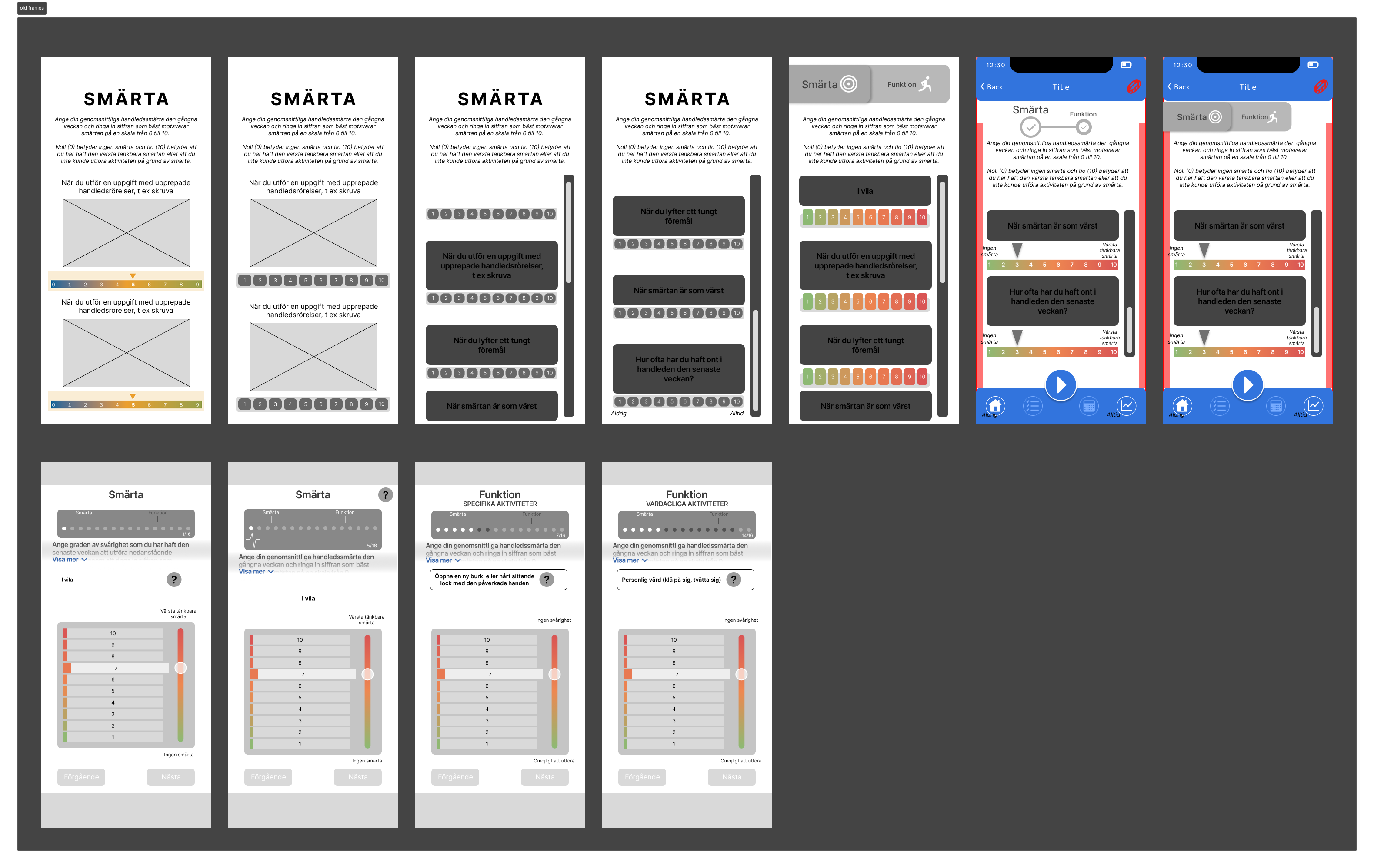
The research also pointed to five other specific problems with the original layout: no visible progress (patients had no idea how long the form was, which creates completion anxiety; the Zeigarnik Effect means showing progress already made significantly increases the drive to finish); scroll-to-continue navigation (no confirmation moment that an answer registered; explicit Next and Start Over buttons fix this); under-sized touch targets (a numbered text row on mobile is too small to tap accurately; the circular button grid brings every target above Apple's 44×44px minimum); dense front-loaded instructions (instructions scroll out of view before patients reach the questions they apply to; separating them and adding a contextual ? button makes help available exactly when needed); and no visual hierarchy (all text at the same weight means eyes don't know where to land; large section headings and distinct input elements solve this). The design exploration started with multi-question layouts (top-left in the board below) before the single-question structure became the clear answer. Each answered question then becomes a discrete, countable step forward, which is what unlocked the gamification model.

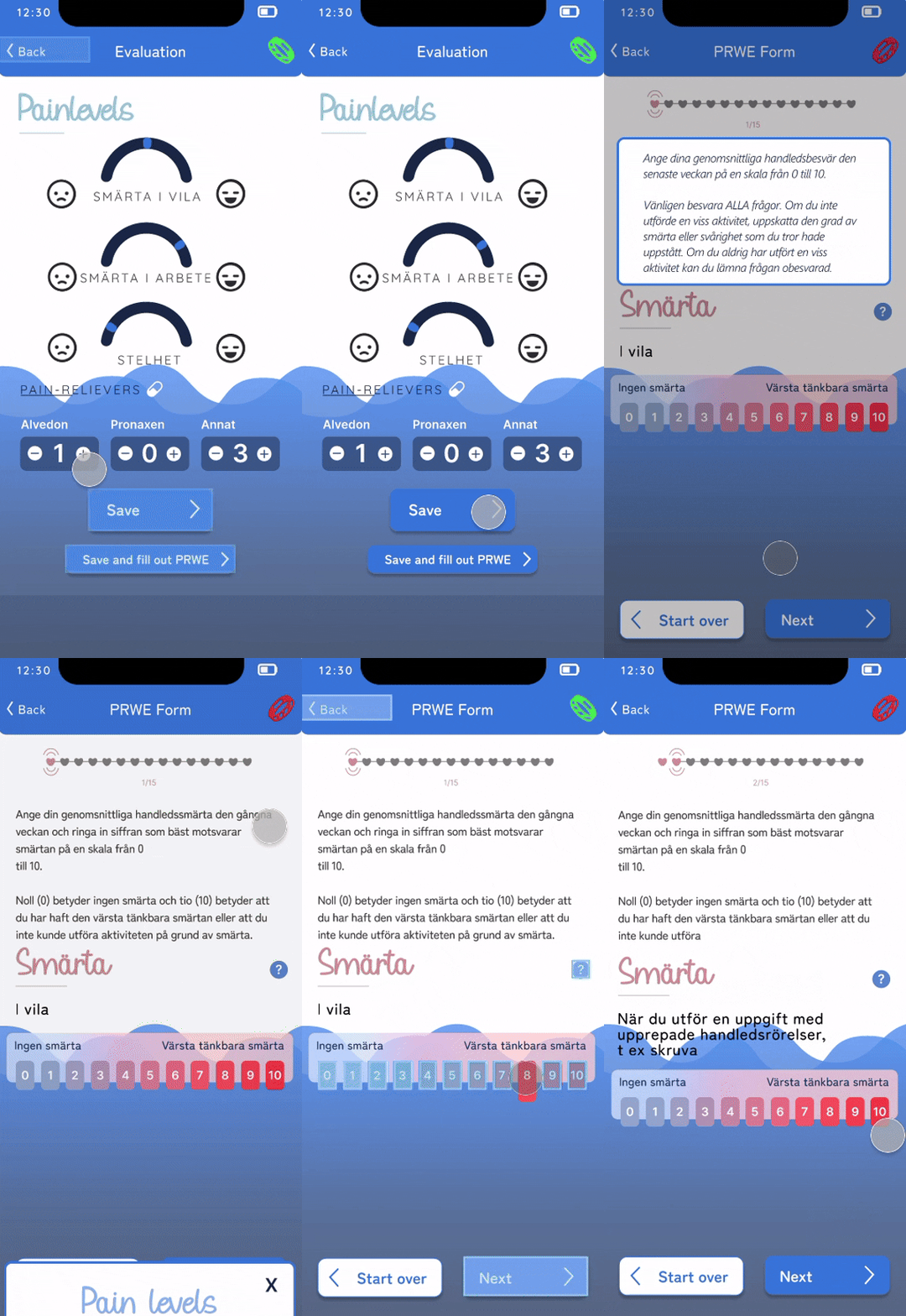
Each PRWE question occupies its own screen. Tapping Next advances to the next question and fills in a heart, progress always visible at the top. The intent was to make completion feel manageable: one question, one action, one step forward.
Design exploration board — iterations from multi-question layouts (top-left) through single-question-per-page and pain scale variations Exploring design layouts
WristCheck — evaluation screen leading into the PRWE form, clicking through questions Filling in the PRWE form

Wristband icon (top right): red = disconnected, green = connected

03

Designing the Pain Scale

Green-to-red is the instinctive choice for any scale, but it asks the wrong question. Green implies "perfect" or "better than normal." For someone in wrist rehabilitation, that framing is dishonest: they may never return to fully pain-free function. The scale needed to ask "does this hurt, or does it feel normal?" Not "how far are you from perfect?"

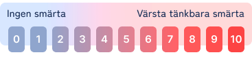
Pain intensity questions use a blue-to-red gradient: blue anchors the low end as neutral and calm (the absence of pain, not an achievement), transitioning through purple to red at the high end: hurt, urgent, stop. The original green-to-red was tested and rejected; green at zero reads as "good" or "safe," which misrepresents how a recovering patient should interpret no pain on a given day. A pure blue-only direction was also explored for difficulty questions, but it read too softly against the background; the low contrast made the scale hard to parse, so the same blue-to-red gradient was kept for both question types. After seeing the final scale, physicians at Linköping specifically praised it.

A doctor consultation note was added to high-pain responses: a prompt to contact their physician if they noticed unusual or unexpected pain. This was a deliberate catch for patients who might push too hard in rehab and underreport to meet expectations. The form needed to signal clearly that the data existed to help them, not to grade their performance.

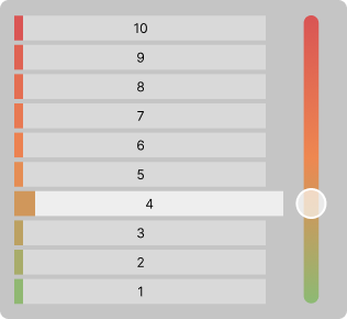
Scale variants explored
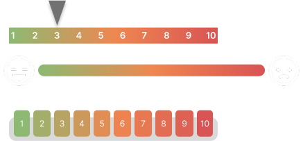
Scale variants — shape and style options explored: numbered pills, gradient bar, slider Shape variants
Scale variant — alternative visual style explored Alternative style
Why this was rejected
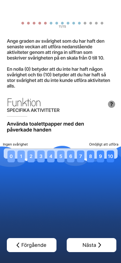
A blue-only gradient was tested for difficulty questions, on the reasoning that red shouldn't appear for effort (only for pain). The problem: the blue scale blended into the app's blue background. Numbers became hard to distinguish, the scale lost its readability, and the low contrast introduced exactly the kind of ambiguity the design was trying to avoid. The same blue-to-red gradient was kept for both question types.
Rejected direction — blue-only gradient for difficulty questions, low contrast against background Blue only scale for function
Pain scale — final design: blue-to-red gradient used for both pain and difficulty questions Final painscale
Scale exploration — alternative direction, not used in final Explored functionality scale
04

Progression System & Graphic Profile

The graphic profile was a collaboration between me and another team member, and it needed to feel like it already belonged to the patient's treatment environment before they even opened the app for the first time.

We based the visual language directly on Linköping University Hospital's website and brand, pulling from the colour palette and visual patterns the institution already used. For patients who would be completing the form repeatedly as part of ongoing care, the app needed to feel like an extension of their treatment context, not a separate product someone had designed independently. Grounding it in the hospital's own tones made that continuity immediate rather than something that had to be built over time.

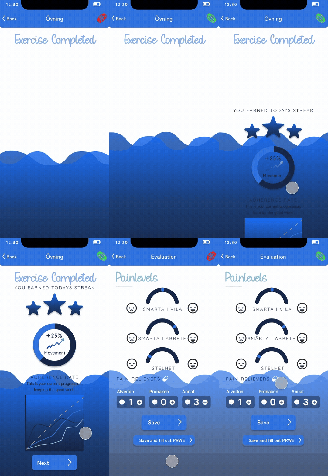
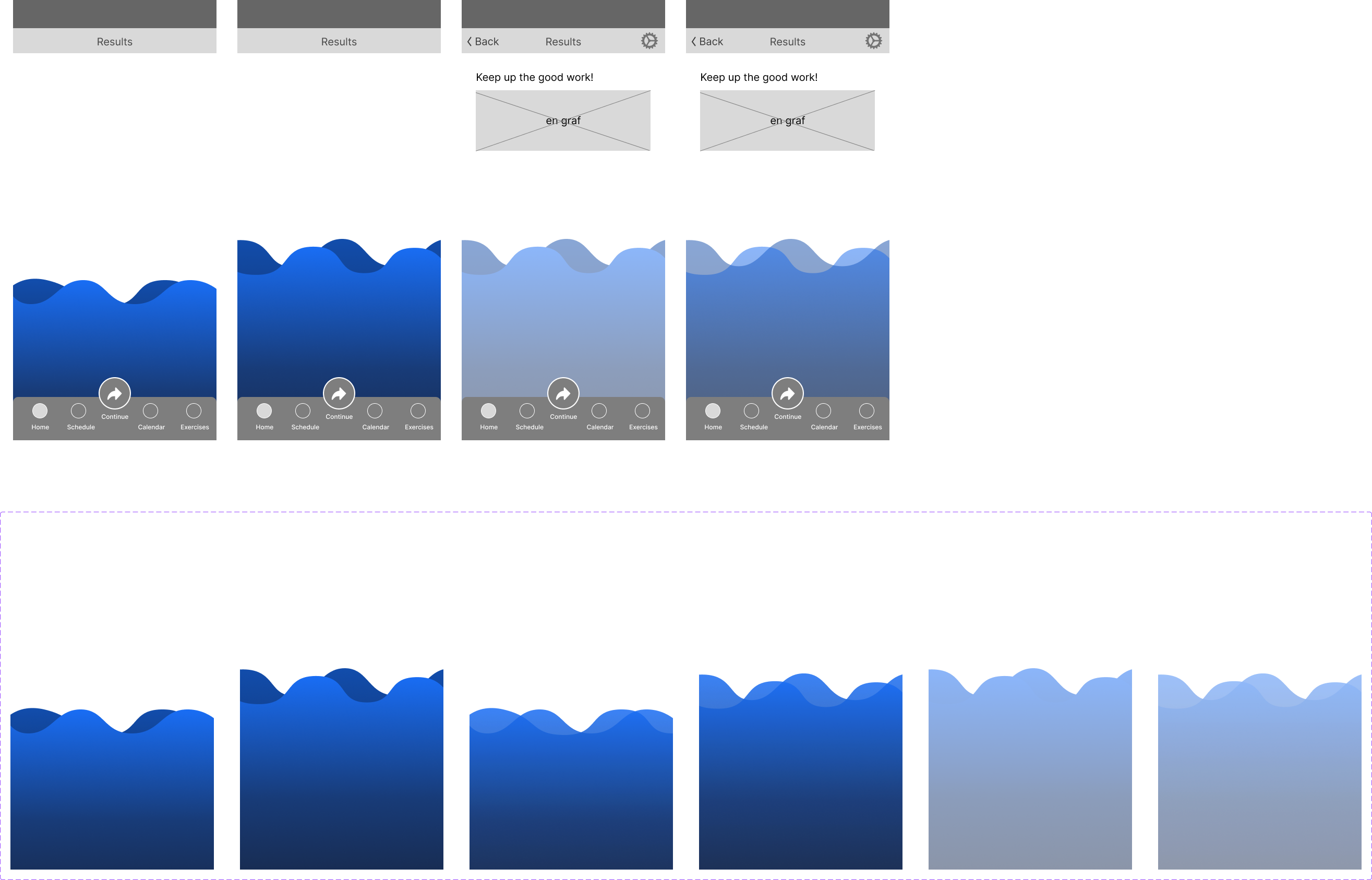
For the progression metaphor, we landed on water rising as the patient completes sessions over weeks of rehabilitation. Water carries no medical connotation, requires no explanation, and reads as progress intuitively regardless of age or background. The physicians at Linköping praised it specifically: it felt like recovery, not administration. Within each session, hearts mark question-by-question progress through the 15-item form, one per question, filling with colour on completion, with grayed-out ones ahead showing exactly how much remains.
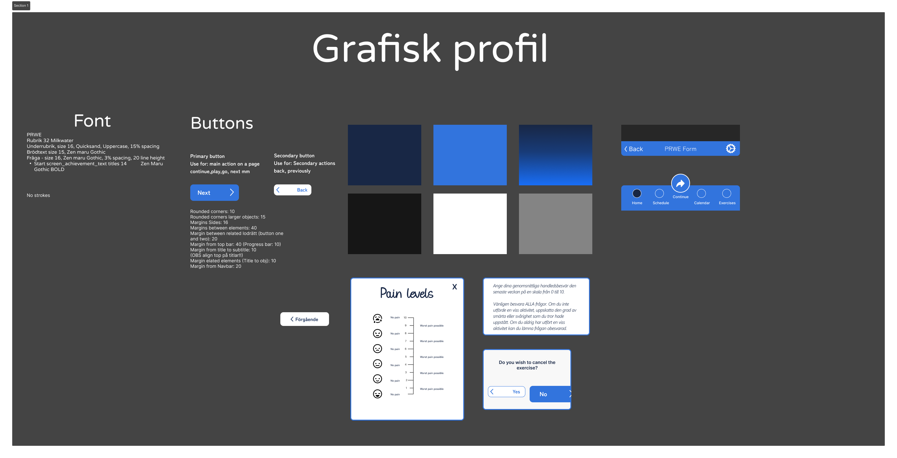
Graphic profile exploration — visual direction and colour system based on Linköping University Hospital Graphic profile
WristCheck — completion screen animation showing water level rising on session complete Water fills on completion
A detail worth naming
The app mixes Swedish and English throughout. The original WristCheck was entirely in Swedish, but the team never made an explicit decision about which language the redesign would use. The result is screens that drift between the two. Settling on a language in week one, before any UI text was written, would have been the right call.
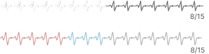
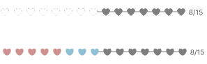
Hearts to indicate form progression: from exploring to deciding Research into medical form completion shows people are significantly more likely to finish when they can see exactly how far they've come, and how little remains. The 15 hearts (one per PRWE question) deliver both: each filled heart marks progress, the grayed-out ones show exactly what remains. Three directions were explored before landing on hearts.

Dots

Progress indicator — dots style exploration

Heartbeat

Progress indicator — heartbeat style exploration

Hearts: chosen ✓

Progress indicator — hearts style, chosen direction Hearts (chosen)
Explore the Figma file
Key Decisions
Decision 01

One question per page

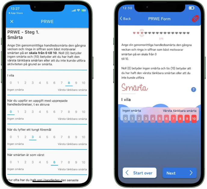
Why: Form psychology research showed drop-off rates spike when users face multi-item pages. Presenting one question at a time reduces perceived cognitive load and significantly improves completion rates, an effect documented specifically in healthcare form contexts where patients are already managing physical and emotional stress. It also creates the discrete progression beats that make gamification possible.

Before / After — original multi-question PRWE form vs single-question per-page redesign
Decision 02

Blue instead of green at the zero end of the pain scale

Why: The original app used no colour distinction on the scale at all, only numbers. Adding colour was itself the first decision: giving patients a second, visual layer for understanding where they are on the scale without having to parse a number. The question then was which colours. Green-to-red is the instinctive choice, but green at the low end implies safety or "doing well," which sends the wrong signal when a patient honestly reports low pain. It frames the absence of pain as an achievement rather than a neutral baseline, which is emotionally misleading in a rehabilitation context. Blue at the low end is calm and neutral: it communicates the absence of pain without suggesting the patient is thriving. Red at the high end stays because it reads as urgent and physiological, which pain is. A pure blue-only scale was also tested for function questions but rejected: the blue blended into the app's background and became unreadable. The same blue-to-red gradient was kept for both question types.

Final pain scale — blue-to-red gradient in app context
Decision 03

Hearts for progress, not dots

Why: Dots require extra visual treatment to mark the current position in a sequence: a different size, a different colour, a ring around the active one. Hearts solve this problem more naturally. The active heart has small pulse lines radiating above and below it, indicating a beat. On a heart, that reads immediately as logical: hearts beat — so the same lines that would feel arbitrary on a dot feel inherent on a heart. The current position is marked without any invented indicator; the shape itself justifies it. A row of 15 outlined hearts with the filled ones behind you, the pulsing one marking where you are, and the grayed-out ones ahead makes progress readable at a glance. The choice was functional first, then expressive.

Progress bar close-up — heart indicators showing 11 of 15 questions completed, with pulse lines on the active heart
Decision 04

Water as the overarching progress metaphor

Why: The metaphor needed to be universally understood, emotionally positive, and completely free of medical connotation. Water rising as you complete sessions reads as progress intuitively regardless of age or background. It avoids gamification tropes (levels, XP, rankings) that patients might find alienating or patronising. The physicians at Linköping praised this specifically; it felt like recovery, not a video game bolted onto a hospital form.

Water progression — Figma frame showing the water fill animation in progress
Results & Impact

Doctors called it genuinely engaging.

The final design was presented to two clinicians from the partnering hospital and two industry mentors from Creative Crowd. The most specific feedback clustered around the parts I was responsible for. The PRWE redesign was the clearest win: the clinicians singled it out unprompted, describing the slide-to-select interaction as feeling more intuitive than a tapped input, and noting how each question animated into view to draw attention to what had changed. The water progression metaphor resonated with both physicians, though it also drew the session's one substantive critique: a concern that a rising water level could read as drowning rather than growth for some users. The team had already discussed this and reasoned toward a slow, incremental fill, but this is a genuine design tension rather than a settled answer and would be a candidate for validation in a staged rollout. The most unexpected outcome of the session was that our exercise-first framing was new to the client: they hadn't considered positioning the product as active training rather than passive measurement, and said it changed how they thought about its future.

7
Person team
3
Week sprint
15
PRWE questions redesigned

"Medical forms are typically boring; your gamified approach made it genuinely engaging."

Clinician feedback, Linköping University Hospital
Reflection

What went well

The decision to research the PRWE form before touching the interface. Understanding what each question clinically measures, and why, created design constraints that actually made the solutions stronger. The blue gradient didn't emerge from aesthetic preference; it emerged from understanding that red triggers anxiety and that the form needs neutral calibration. The water metaphor didn't emerge from brainstorming; it emerged from knowing we couldn't use medical connotations. You can't break something you understand. That principle held across every major decision in this project.

What I'd do differently

Team organisation from day one, and accounting for the calendar. The project straddled Christmas break: 1.5 weeks before, 1.5 weeks after. Nobody could fully commit in week one knowing the break was coming, and rebuilding momentum in January took longer than it should have. Combined with unclear ownership from the start, it meant the real work compressed into a shorter window than planned. A proper kick-off in week one, with assigned responsibilities and an explicit plan for getting back up to speed after the break, would have changed the shape of the project significantly.

What I'd explore next

One clinician noted that patients are measurably stiffer before exercising than after, which makes the timing of measurement clinically meaningful. That's a direct prompt for the PRWE form: capturing pre- and post-session states separately would give clinicians more useful data, and is the first thing I'd prototype in a next iteration. On top of that, differentiating the pain and function scales visually is still unresolved and would be the other immediate design challenge to tackle.

← Previous Project Flower Shop Back to All Works Next Project → Pet Me, Please
Top